Template MediCenter Documentation
Installation
MediCenter template documentation
(based on VikAppointments extension)
Template installation
Step 1 - Install E4J MediCenter template
After unziped the .zip file, from your back-end setting panel, go to: "Extensions → Extension Manager", browse E4J MediCenter installation package of your Joomla version then hit the "Upload and Install"

Step 2 - Set default template style
Go to: "Extensions → Template Manager", set E4J MediCenter template style as your default template style.

Modules List
Here the list of all the modules that we used in the our demo website, click on the module name to download it directly:
VikAppointments Search (you can find this module inside the VikAppointments component package)
VikAppointements Employees (you can find this module inside the VikAppointments component package)
VikAppointements Employees Filter (you can find this module inside the VikAppointments component package)
Template Settings
In this page you can choose different parameters, from the logo setup to the choice of your text size.
Template Configuration
Color Layout
On this page you can choose the color variation your prefer for your website, there are 5 colors palette.
Extensions -> Template Manager -> E4J MediCenter

Logo Setup
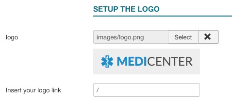
Choose the logo for your website.
Extensions -> Template Manager -> E4J MediCenter
Fonts Template
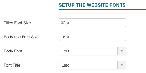
You can choose different fonts and size for the website’s body and headers.
In our demo website we used:
- Titles Font Size: 32px;
- Body text Font Size: 16px;
- Body Font: Lato;
- Header Font: Lato;
Hide Homepage Content
With the "Hide Homepage Content" you could hide the html structure that shows the articles in your homepage, with related padding and spaces.
Please, use this parameter just in the case you don't want to show any article printed on the main website area.

In our demo website we set it up to: NO.
Responsive layout
With the Responsive Layout you could choose if show your website responsive and adaptable for all the devices:
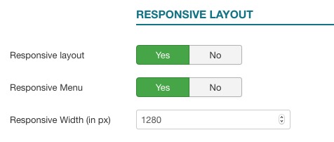
With these parameters setup you can choose if you want to display the Responsive Menu or leave the normal menu.
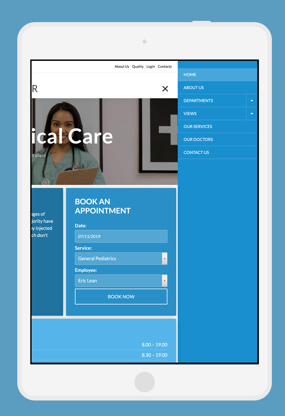
In the case the Responsive Layout has been setup to YES, the responsive framework will be displayed below the value "Responsive Width".
This is a preview:
Menu Configuration
Menu Fixed
This parameter will let the header follows the vertical scolling navigation of the website.

Header Settings
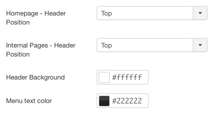
With these parameters you can setup the style of your header.
- Homepage - Header Position: With this parameter you can choose to display the header over the slider or in the top of it.
By choosing "Over Slider", your header will be displayed with a black background with transparency. By choosing "Top" instead, you'll be able to select a Header Background. On this last case, the slider will not take all the window size in width and height, but just in width, the height will be calculated automatically.
Here some screenshot of the two choices.Over Slider
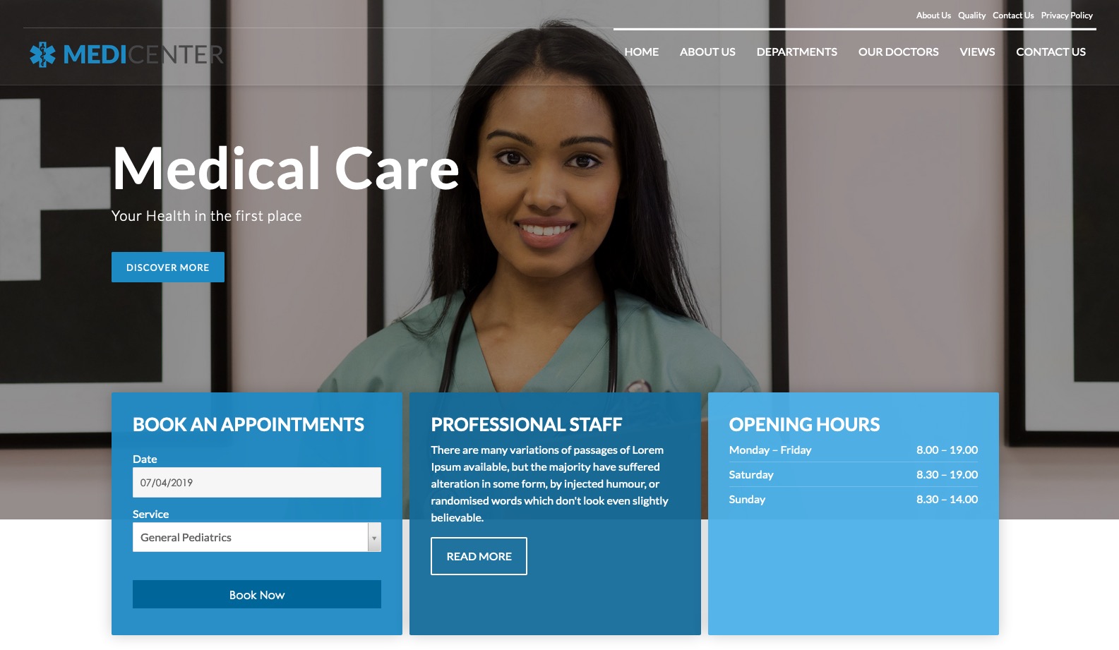
Top (We've selected a white header background)
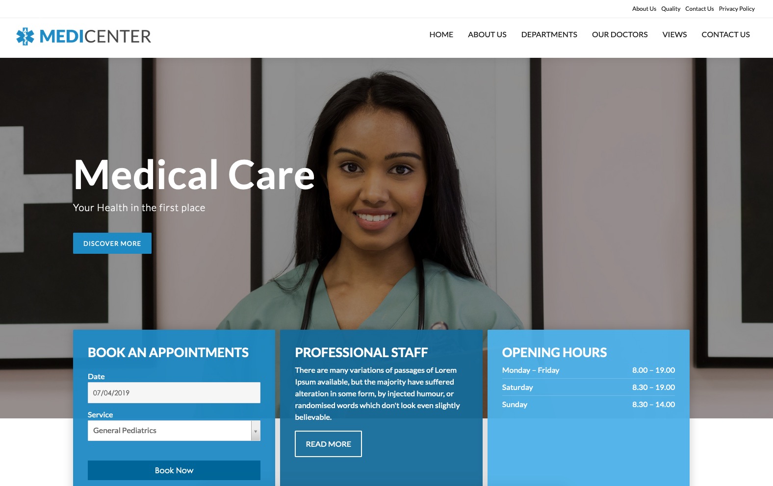
- Internal Pages - Header Position: This parameter works in the same way of the Homepage - Header position. But it'll managed the internal pages.
- Menu Text Color: This parameter setup the color of the menu text for homepage and internal pages.
Responsive Menu
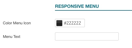
With these parameteres you can select the color of the text and menu icon in the responsive mode. If the Menu Text field is empty will be displayed just the responsive menu icon.
Page Configuration
In this part of the documentation will explain how to setup the template as our demo website step by step. Starting from the header till the footer.
Header Configuration
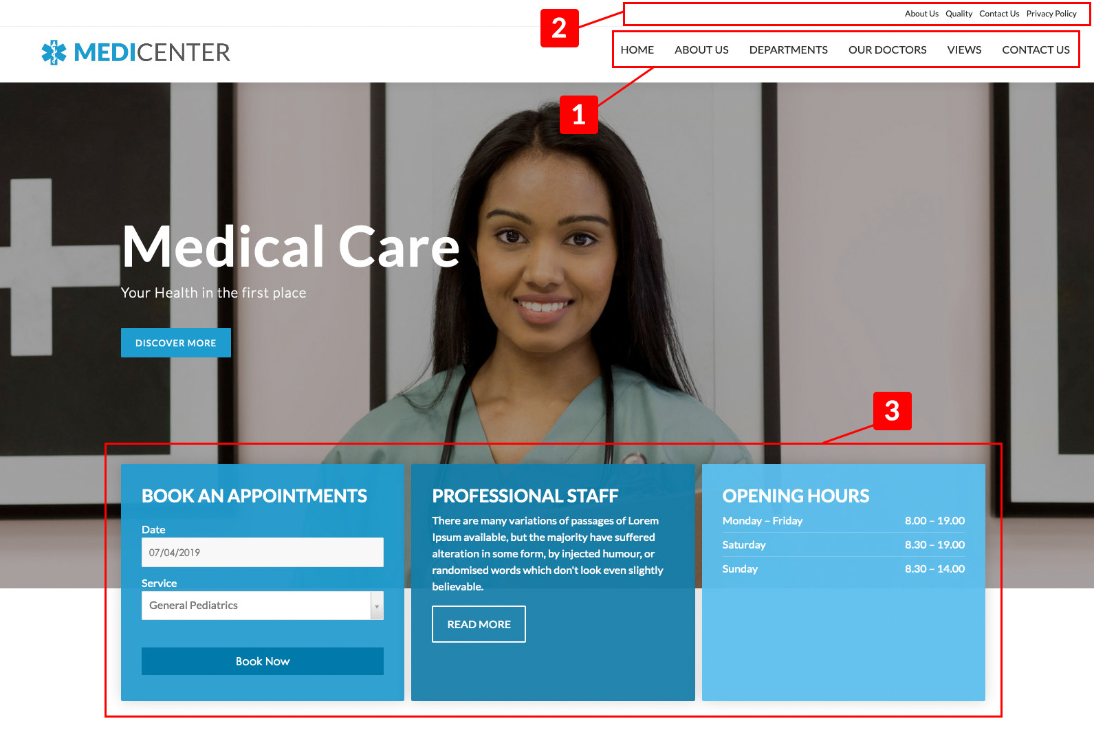
- 1 This is a simple Menu module setup in the "upmenu-right".
Module-position: upmenu-right
- 2 This is the Main Menu module setup in the "mainmenu".
Module-position: mainmenu
- 3 This part is composed by three modules all published in the same Module position:
- BOOK AN APPOINTMENTS: This is VikAppointments Search module. You can find it inside the VikAppointments package.
We listed just the parameters that we've changed from the default values.Module Configuration
- Orientation Vertical
Module-position: slide-down - PROFESSIONAL STAFF: This is the native Custom HTML module of Joomla. We've simply add simple text.
Class-Suffix: color3
Module-position: slide-down - OPENING HOURS: This is the native Custom HTML module of Joomla. We've simply add simple text.
Here the HTML code we've used for the structure of the hours:
- BOOK AN APPOINTMENTS: This is VikAppointments Search module. You can find it inside the VikAppointments package.
<ul class="list-unstyled">
<li>Monday – Friday
<div>8.00 – 19.00</div>
</li>
<li>Saturday
<div>8.30 – 19.00</div>
</li>
<li>Sunday
<div>8.30 – 14.00</div>
</li>
</ul>-
Class-Suffix: opening-hours color2
Module-position: slide-down
HomePage Configuration
The Images Slider

- 4 This is the Vik Content Slider module (you can find the download link in the Modules List chapter or in the module explanation here).
We listed just the parameters that we've changed from the default values.Module-position: slider-fullscreenModule Configuration
Slider Options
- Title Effect: FadeInUpBig
- Description Effect: FadeInUp
Home Content

- 5 This is a simple Article of Joomla. We've connected our Home menu item to a simple article of Joomla. We've hide the article title, and decided to insert our title inside the article content.
Services List and Departments Menu
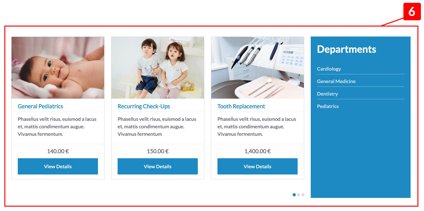
- 6 This part is composed by two modules.
-
The first module is the VikAppointments Services, you can find it inside the VikAppointments package and it'll show the Services added on the component.
Module Class Suffix: width75 no-padding
Module-position: module-box2 -
The second module is the native Menu module of Joomla and we have selected a menu we have created with all the services as menu items.
Module Class Suffix: width75 no-padding
Module-position: module-box2
-
Icons and Opening Hours

- 7 This part is composed by two modules.
-
The first module is the already known Vik Icons module (you can find the download link in the Modules List chapter or in the module explanation here).
We listed just the parameters that we've changed from the default values.Module Configuration
- Show Title: Hide
Icons Options
- Icons Size: 35
- Icon Style: Circle
- Box Container: Full Size
- Padding Size: 4
- Content Alignment: Default
- Icon Alignment: Bottom
Module Class Suffix: width75 no-padding service-ico
Module-position: module-box3 -
The second module is the native Custom HTML module of Joomla. As you could see the content is the same used for the module in the Slide Down position. Please, check the html code here.
Module Class Suffix: width25 color
Module-position: module-box3
-
Testimonials
-
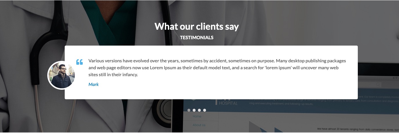
8 This part is composed by two modules. The first module is the Vik Wall Image that shows an image as background, the second module is native Vik Words module loaded over the previous one and it shows the testimonials blocks.
Let's start to configure the Vik Wall Image (you can find the download link in the Modules List chapter or in the module explanation here).
We listed just the parameters that we've changed from the default values.Module Configuration
Module Options
- Show Title: Hide
Module Class Suffix: no-padding
Module-position: fullboxThe Vik Words module (you can find the download link in the Modules List chapter or in the module explanation here).
We listed just the parameters that we've changed from the default values.Module Configuration
- Show Title: Hide
Options
- Sentence Layout: Carousel
- Sentence per row: 1
- Color Title: #fff
- Image Position: left
On Joomla you could load a module by using a specific tag named "loadposition homethumb" between curly brackets. The homethumb is the custom position we decided to use for our module. For more information about how to use the loadposition tag, please, read our Knowledge Base article here.
Module-position: testimonials

- 9 This is the VikAppointments Employees module, you can find it inside the VikAppointments package and it'll show the Employees added on the component.
Module Class Suffix: main-size grey title-center
Module-position: fullbox
Latest News section
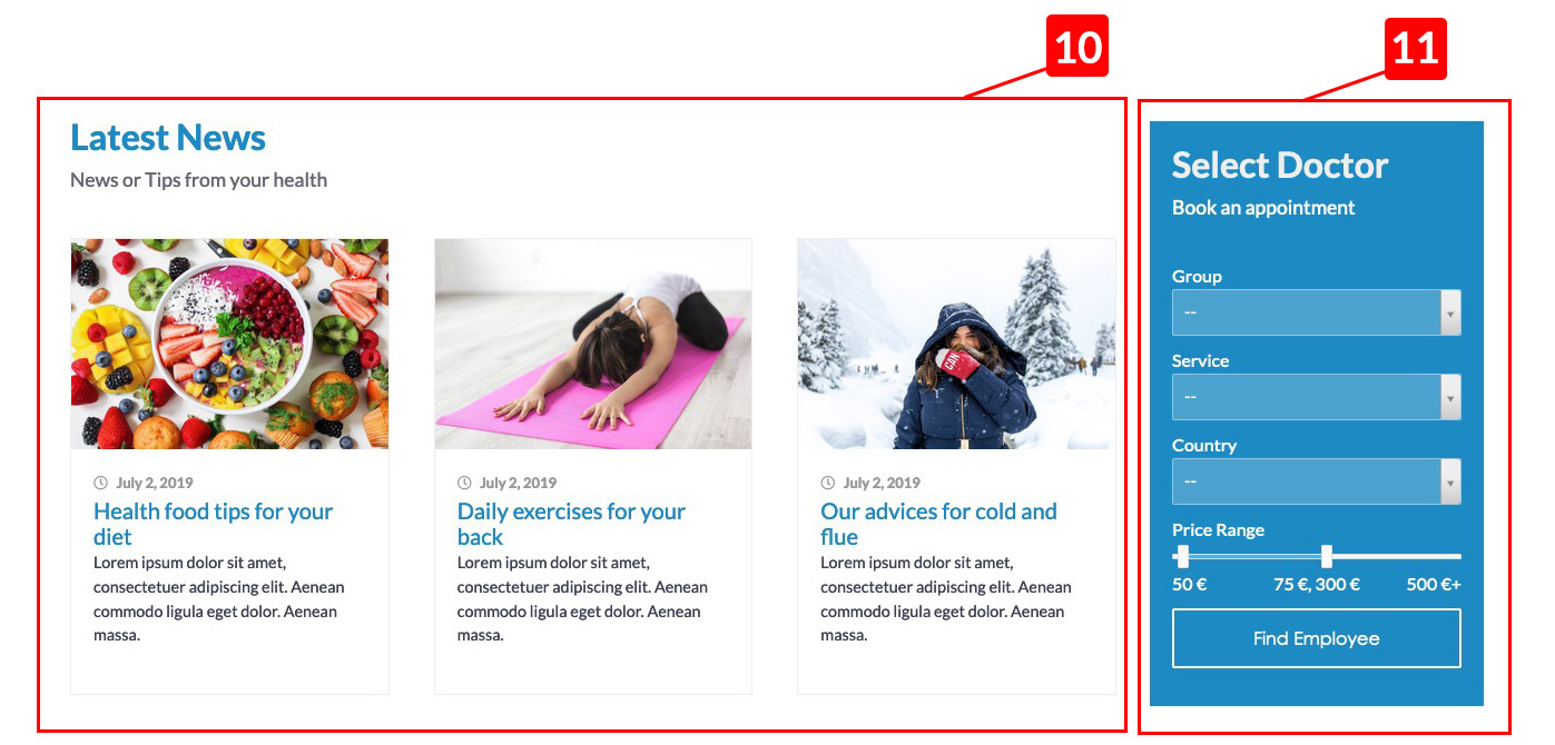
- 10 This is the native module of Joomla that shows the articles of specifics categories (each block is an article), you could add it in the Extensions > Modules > New > Articles - Category.
Each article had a title, text content and intro image published.Module
- Show Title: Latest News || News or Tips from your health (To split the title just use two pipe || )
Filtering Options
- Category: Insert your category name
Display Options
- Intro Text Show
Module Class Suffix: width75 no-padding
Module-position: module-box4 - 11 This is the module VikAppointments Employees Filter, this is part of the VikAppointments package. You can use this module to let your customer filter your employees based on the location or other filters.
Module Class Suffix: width25 color
Module-position: module-box4
Footer Configuration
Footer

- 12 The four blocks are, in order from left:
-
Custom HTML module
Module Class Suffix: width25
Module-position: footer -
Menu module
Module Class Suffix: width25
Module-position: footer -
Menu module
Module Class Suffix: width25
Module-position: footer -
Vik Icons (Contact Information)
This is the Vik Icons module (you can find the download link in the Modules List chapter or in the module explanation here).
We listed just the parameters that we've changed from the default values.Module Configuration
Module
- Show Title: Hide
Icons Options
- Icon Size: 14
- Box Container: Default
- Padding Size: 12
- Icon Alignment: Left
Module Class Suffix: width33 footer-contacts
Module-position: footer
-
SubFooter
- 13 Vik Icons
This is the Vik Icons module (you can find the download link in the Modules List chapter or in the module explanation here).
We listed just the parameters that we've changed from the default values.Module Configuration
Module
- Show Title: Hide
Icons Options
- Icon Size: 14
- Box Container: Full Size
- Padding Size: 12
- Icon Alignment: Left
Module Class Suffix: text-center
Module-position: subfooter
About Us
Header

- 1 This is the already known Vik Wall Image module.
Module-position: slider-fullscreen
Module Class Suffix: text-centerModule Configuration
- Show Title: Hide
Options
- Title Effect: FadeInDown
- Title Effect: FadeInUp
- Level Opacity Mask: 0.3
N.B. You'll see this layout in most of the pages of our demo website, they are all Vik Wall Images and they've been configured in this same way.
Article Content
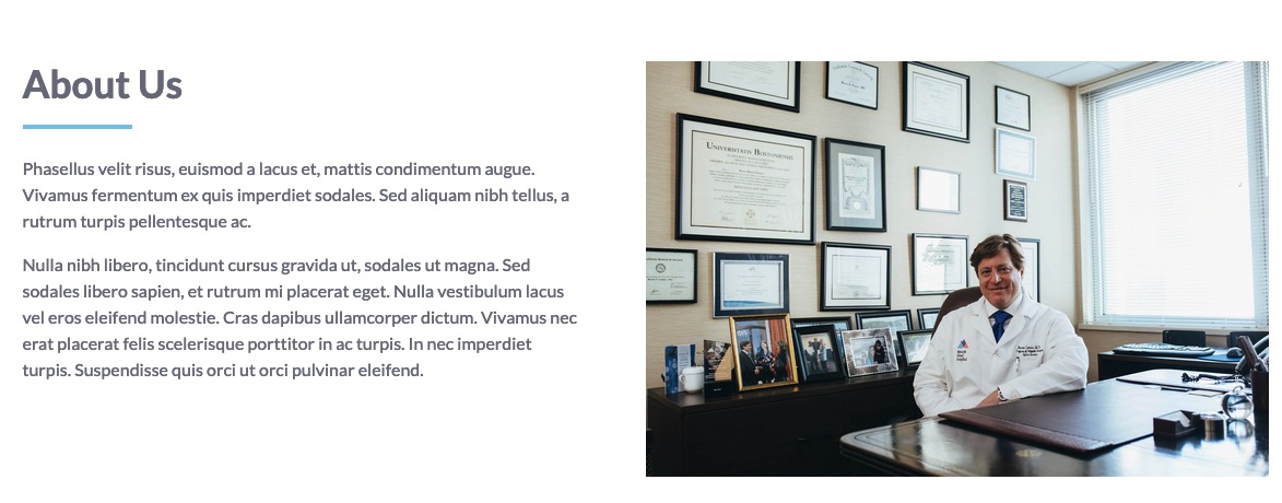
- 2 This a simple article content. In this case we've just created our text and an image inside the textarea. Both have been added in a div with class "caption".
The class caption, setup the contents in two columns. Each column has a caption class. To setup a content inside a class caption, you should just select each content and from the TinyMCE editor select the button Format > Formats > div.caption.
Employees List

- 3 This is the VikAppointments Employees module that we've already used in the Homepage.
Module Class Suffix: title-center grey Module-position: subcontent
Why choose us

-
4 This the Vik Counters module, with this module you can create as many counter you want. Please, how to use the module on the dedicated page. We listed just the parameters that we've changed from the default values.
Module Configuration
- Show Title: Show
- On our demo website we used for all the counters the FontAwesome icons. Here a configuration example for one counter.
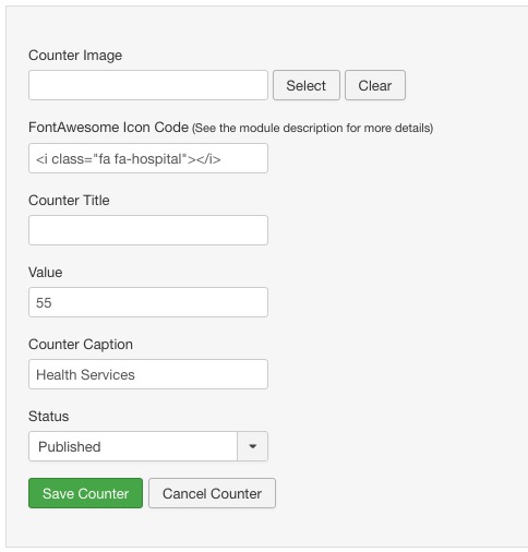
Counter Options
- Padding Size: 2
Module Class Suffix: text-center bg-color
Module-position: fullbox
Contact Us
To know more about the Image Header, please, check the explanation of the Header of the About Us chapter.
Google Maps

- 1 This is the Vik Google Maps module (you can find the download link in the Modules List chapter or in the module explanation here).
We listed just the parameters that we've changed from the default values.Module Configuration
- Show Title: Hide
Map Settings
- Map Height: 400px
- Zoom Level: 12
- Center Map Latitude: Insert the Latitude
- Center Map Longitude: Insert your Longitude
- API KEY: Insert your API Key, to see how to create it, please read the Knowledge Base article here.

-
Contact Details
- Contact Enabled: Yes
- Contact Position: Left
- Text Above Details: On this area you can copy the same HTML code of the others OPENING HOURS modules. Please, copy the same HTML code of this chapter, on this area.
-
Locations
- Latitude and Longitude: Insert here your coordinates
Module-position: slider-fullscreen
Contact Us Article

- 2 This is a simple Article of Joomla. We've connected our Contact Us menu item to a simple article of Joomla. We've added a blue border by adding a class in the paragraph. The class is text-border.
Contact Info
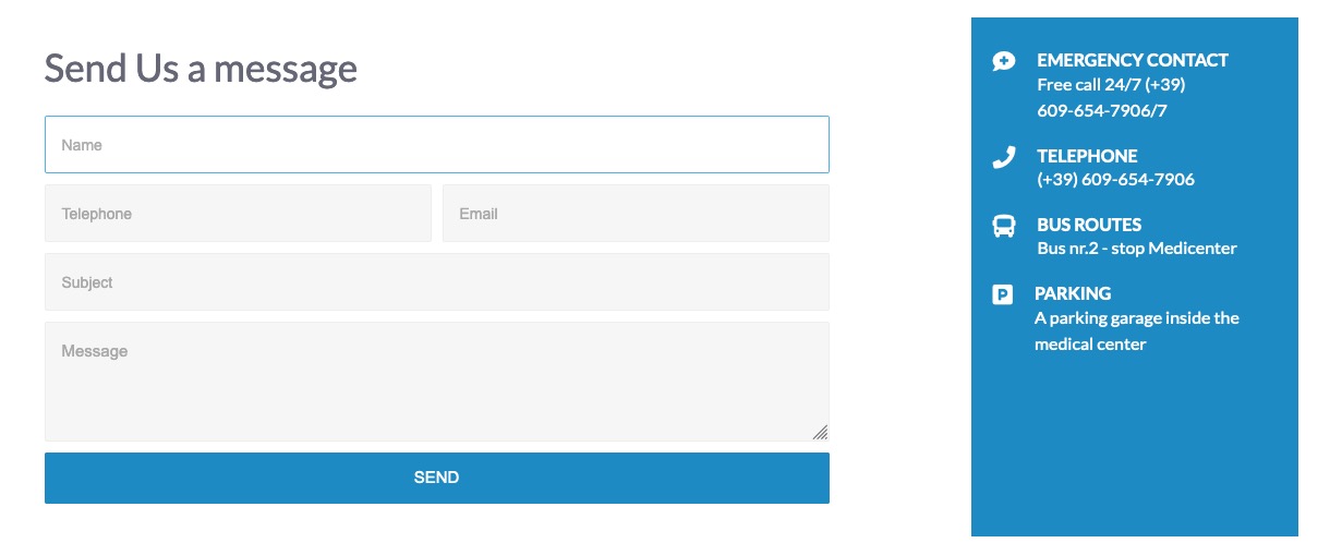
- 3 On this part you can find two modules published in the same position.
- The form is our module Vik Contact Form (you can find the download link in the Modules List chapter or in the module explanation here).
Module-position: module-box4
Class-Suffix: width75 - The second module is the already known Vik Icons module (you can find the download link in the Modules List chapter or in the module explanation here).
We listed just the parameters that we've changed from the default values.Module Configuration
- Show Title: Hide
Icons Options
- Icons Size: 21
- Padding Size: 12
- Content Alignment: Default
- Icon Alignment: Left
Class-Suffix: width25 color contactus
Module-position: module-box4
- The form is our module Vik Contact Form (you can find the download link in the Modules List chapter or in the module explanation here).
Module Class Suffix
To customize the modules from the standard Joomla layouts, you can use the Module Class Suffix. On each module you should search for the Class Suffix parameter, based on the module you're using, you could find it in different positions inside the module configuration, sometimes you could find it in the Advanced Options tab.
Here the list of the class suffix that you can use with this template, next to it you can see their examples:
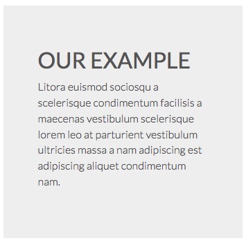
Grey Background
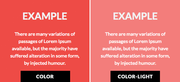
Colored Background
Class-suffix: color-light
Transparent Background
Some template position could have some background color, in the case you'd like to have a transparent background, you could use it class suffix.
White Background
The White class suffix could be used in some situation where there is a default grey or colored background, it could be useful if you'd like to use the loadposition to setup a new module hover another one.
Title Centered
With this class suffix you are going to center the Title of your module.

Remove Padding
With this class suffix you're going to remove the space of the padding and margin applied by default to a module.
Bottom Left Border
This class suffix applies a border bottom left to the text that has this class. It could be used also like a normal class in the html editor.
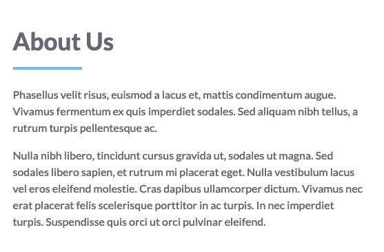
In our example we have used the following code for the title:
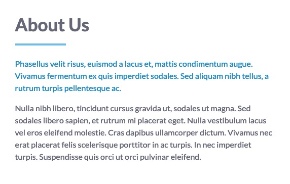
<h3 class="text-border text-border-left">About Us</h3>Text Colored
By using this class suffix you'll change the default color text to the color of your template variation.
Text Colored Inherit
By default the template sets the color of the titles h1, h2, h3, h4 and so on, to the color of the template variation, if you'd like to have the same color of the body text, you can use this class suffix.
font-body / head-font
By using this class you can apply to the selected part of text, the Font Family selected for the Body in the Template Configuration.
By using this class you can apply to the selected part of text, the Font Family selected for the Titles in the Template Configuration.
Font Light
By using this class you can change to normal the weight of a text. An example, the headings H1, H2, H3..., have the font weight set to bold, with this class you could change it to regular, and your heading will have a normal weight.
Module Width
The following Class suffix setup the module width, you can setup manually the width of each module to manage more easily the layout that you'd like to have. The default width for each module is 100%.
You can use the following class suffix to define the width of your module:
- width100
- width75
- width50
- width33
- width25
- width20
Hide module on smartphone
With this Class Suffix you are going to hide a module in the smarthphone view.
CSS CUSTOMIZATIONS
How to customize your template
This template has the custom.css file to place all your CSS customization. It is recommended to add all your modifications on this file, in this way you'll never lose them, this file will never be overridden in future template updates.
You can find the file in the panel Extensions > Templates > Templates > e4j MediCenter Details and Files > css > custom.css
Modules Position
Map Modules
This is the Map Modules position of this template:
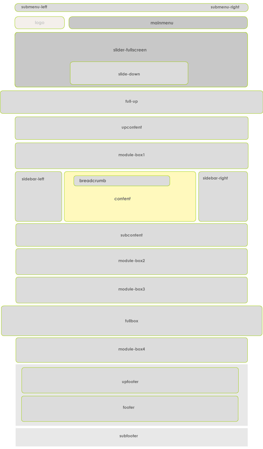
The debug position can be used to setup Cookies or Google Analytics modules.
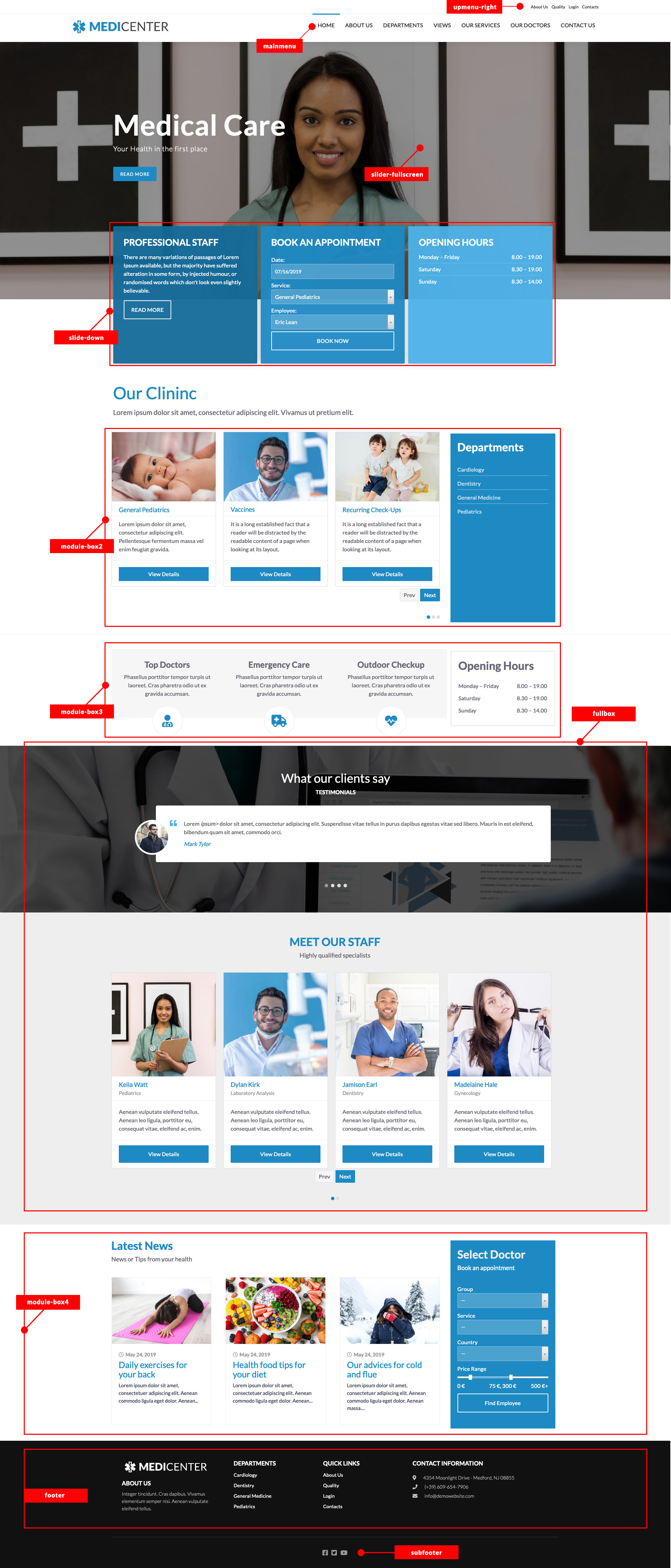
Demo website position modules
TROUBLESHOOTING
Google Maps is not working correctly
In this case there could be some problem with your Google Maps API Key.
You should analyze the website with a browser inpector and see in the Console if there is a jQuery error about Google Maps. Usually the error comes with a link to the Google Maps documentation that explains more details about your error.
Most of the time, in the Google Maps Platform you should check up the API Key that you've created is correct.
For further information about the Google Map API Key, please, follow the dedicated article here.
THEME UPDATE
To know how to update the template, please, check our Knowledge Base on this link.
