Template Time Documentation
Installation
Time template documentation
(based on VikAppointments extension)
Template installation
Step 1 - Install E4J Time template
After unziped the .zip file, from your back-end setting panel, go to: "Extensions → Extension Manager", browse E4J Time installation package of your Joomla version then hit the "Upload and Install"

Step 2 - Set default template style
Go to: "Extensions → Template Manager", set E4J Time template style as your default template style.

Modules
Here the list of all the modules that we used in the our demo website :
Vik Appointments Search (you can find this module in the Vik Appointment package)
Vik Appointment Cart (you can find this module in the Vik Appointment package)
Vik Appointments Services Shuffle (you can find this module in the Vik Appointment package)
Vik Appointment Employees Grid (you can find this module in the Vik Appointment package)
Template Settings
Logo Setup
In this page you can choose different parameters, from the setup of your logo to choose the size of your text.
Extensions -> Template Manager -> E4J Time

Colours layout
In this page you can choose the color variation your prefer for your website.
Extensions -> Template Manager -> E4J Time

Fonts Template
You can choose different fonts and size for the website’s body and headers.

Menu Fixed
This parameter allow your header to stay up to the website when you are scrolling this one.

This is a preview:

Responsive layout
With the Responsive Layout you could choose if show your website responsive and adaptable for all the devices:

This is a preview:
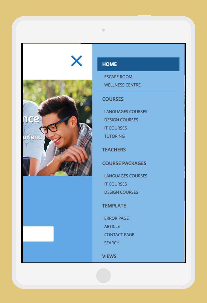
Main Menu Setup
Create the menu
After installation of the template click on Menus » Menu Manager Menu » Add New Menu in the administration menu on top. Give it a name and click on Save & Close.
You can now assign menu items to the menu. Click on Menus » YOUR MENU » Add New Menu Item.
Assign the menu
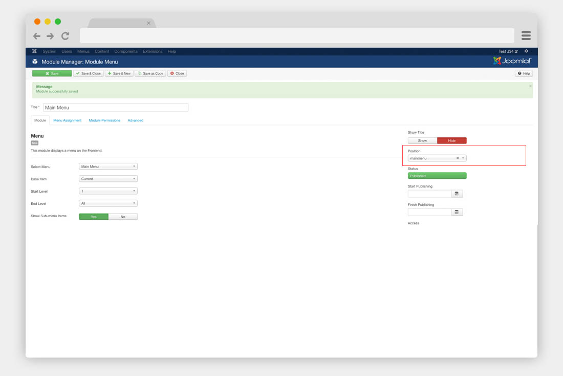
Before the menu works properly in your template, you have to assign it to a menu module published on the mainmenu module position. To achieve this, click on Extensions » Module Manager » New. Choose Menu. Next publish the module on the mainmenu position of the template.
Modules Configuration
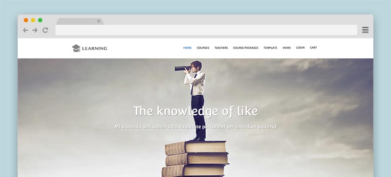
As you could see from our demo website we have three demo layout: Learning, Escape Room and Wellness Centre.The modules we used for this three layout are quite same, following the documentation you could read about all this modules and it variants for each demo layout.
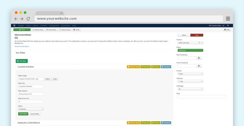
Vik Content Slider - Setup the Slider module
With this module you can create as many slider as you want through the "Add slide" button. The configuration is quite simple, you should just to choose the visibility of dots, arrows, autostop, etc and the alignemet of the text.
Once you have done it, you have the following fields for each image:
- Slide image This field allow you to choose the images
- Slide Title slide In this field you can write the title of your slide
- Slide Caption This is the field for the description of your slide
ADMIN SIDE:
Vik Appointments Cart
This module shows the summary of your services shopping.

To have this kind of display you should set the following parameters and configuration:
Class Suffix: modopen (please leave a white space before start to write - for more information how to do it, just look the next chapter)
Vik Appointments Search
This is one of the main modules of Vik Appointments, you can find it in the Vik Appointments extension package.
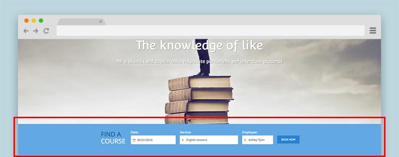
In our demo website we setup it in this way:
Class-suffix: color search-horizontal title-center title-wrap (please leave a white space before start to write - for more information how to do it, just look the next chapter)
In this module we used multiple class suffix some of them will explain later in this document but about the "search-horizontal" class it's a suffix that is usable just for this module.
Vik Appointments Service Shuffle
This module displays the services of your Vik Appointments in a grid view and with a shuffle mode.
The tag categorization are the Group names, you can choose which groups want to show and which services of the group you choose to show.
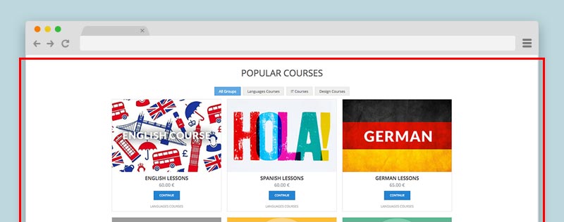
Class Suffix: title-center border-top (please leave a white space before start to write - for more information how to do it, just look the next chapter)
Vik Appointments Employees Grid
This module shows the list of the Employees of your VikAppointments.
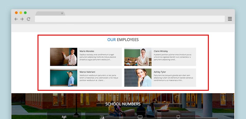
Class Suffix: title-center (please leave a white space before start to write - for more information how to do it, just look the next chapter)
Vik Words (Testimonials module)
With this module you can insert different sentences with Title and text and slide them with a fade In and Out effect.
With the Options parameters you can decide the velocity In and Out of the fade effect.
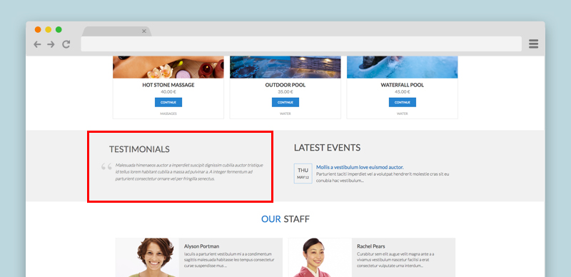
The parameters are the following:
- Title Your title testimonial
- Description Your text description
- OPTIONS TAB
- Box width Inside this field you can set the with of the box, by default it'll be 100%
- Box height The box needs a height value, by default we use 100px
- Time delay The time between the sentences changing
- Time Fade Out The velocity time of your fade-out effect
- Color Title The color of your title
- Enable Quotes With this field you can enable or not the big quotes beside the text description
Class Suffix: width50 (please leave a white space before start to write - for more information how to do it, just look the next chapter)
Vik Wall Image/Vik Counter
Vik Wall Image
This module allow you to insert a big image as a background of a particular template area, the image can roll or can be fix.
Module parameters:
- Background - with this parameter you can insert the background image that you want.
- Your content - here you can insert all the content that you want to be showed over the image.
- OPTIONS TAB:
- Type image - you can choose to let your image scroll or not during the scrolling page.
- Enable mask - you can choose if enable or not the color mask hover your image, then you can choose the color and the opacity mask.
- Prepare content - it's the parameter that you need to enable if you want embed some modules using in the textarea of Vik Wall Image
WELLNESS CENTRE AND ESCAPE ROOM LAYOUT:
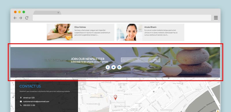
Backend example 1 - Backend example 2
Here the code of our demo website that you can easily copy in your textarea:
<div class="e4j-newslett">
<div class="e4j-float-left">
<h3>JOIN OUR NEWSLETTER</h3>
<h4>SUBSCRIBE TO BE UPDATE ON OUR OFFERS</h4>
</div>
<div class="e4j-float-right">
<div><input type="text" /><input type="submit" value="JOIN" /></div>
</div>
</div>
<div class="e4j-socialcustom">{loadposition social}</div>Class-suffix: custom-newsletter (please leave a white space before start to write - for more information how to do it, just look the next chapter)
As you could see we used some social icons in the Escape Room and Wellness Centre layouts, that icons are from our Vik Icons module that has been called through {loadposition} in the Vik Wall Image module.
LEARNING LAYOUT:
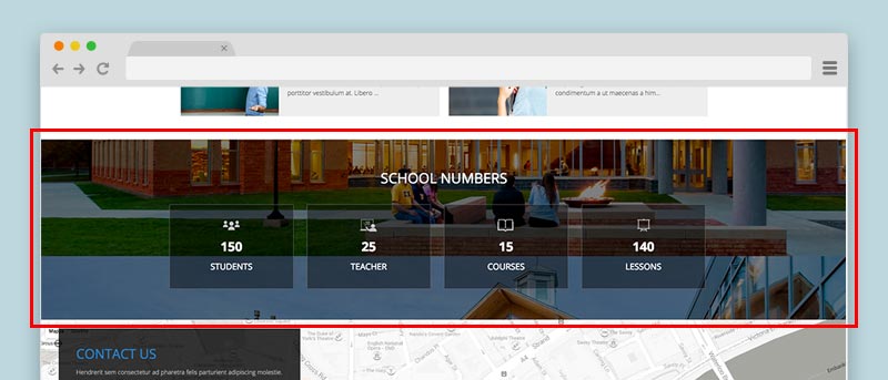
Here the code of our demo website that you can easily copy in your textarea:
<h3 style="text-align: center; font-size: 32px;">SCHOOL NUMBERS</h3>
<p> </p>
<div>{loadposition numbers}</div>Vik Counter (School numbers)
With this module you can create different counters. You can define title, description, image and the final value to reach in your counting, for each counter you create.
- Counter Image - Define an image for your counter.
- Counter Title - A title for your counter.
- Value - This is the number that the counter will reach at the end of its counting.
- Counter Caption - Every counter could have a different caption
- COUNTER OPTION TAB:
- Padding Size (from 1 to 12) - With this value you can decide how much space the element will have
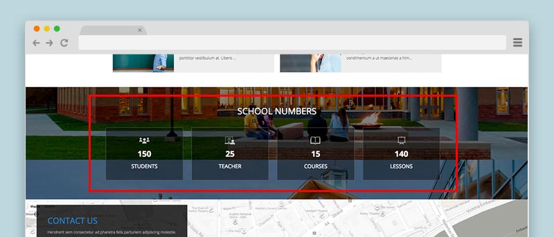
Class Suffix: bg-transp title-center (please leave a white space before start to write - for more information how to do it, just look the next chapter)
Vik Google Maps
Module to locate your important points with Google Maps, the module allows you to customize every point with a marker, title and description.
Set the latitude and the longitude coordinates of your locations and optionally add a text, a description and a customized image and shadow for the marker.
The default images are located in the folders /modules/mod_vikgooglemaps/src/markers/markers/ shadows and shapes.
Leave the image fields empty to use the default Google Marker.
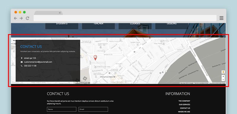
MODULE PARAMETERS:
Map Setting:
- Map width and Map height in this fields you need to set the size of your map, if you want a full size map, use the 100% value for the width and then set a fixed height, an example 400px
- Map style the module allows you to choose different map style for your website
- Map Center and Zoom level this three parameters are very important to center your map and give it a properly view, you need to set up to see correctly your map
Contact Details:
with this view you insert all your contact details and choose where position, you can always disable it whenever you want through the params Contact enabled.
Locations:
in this view you can insert your locations and for each one choose the type of marker you want, title and description of your point and set it up the longitude and latitude.
Vik Contact Form (Contact Us)
You can create a simple Contact Form for your website.
Here the module fields:
- Show Labels - This field showa the labels.
- Name - Enable the Name field.
- Surname - Enable the Surname field.
- E-mail - Enable the E-mail field.
- Telephone - Enable the Telephone field.
- Text Field - Enable the internal text.
- Subject - Enable the Subject form.
- Description
- FORM OPTIONS TAB:
- Email to - Inside this field you have to insert the email where to receive the email from the customers.
- Width - The form width.
- Height - The form height.
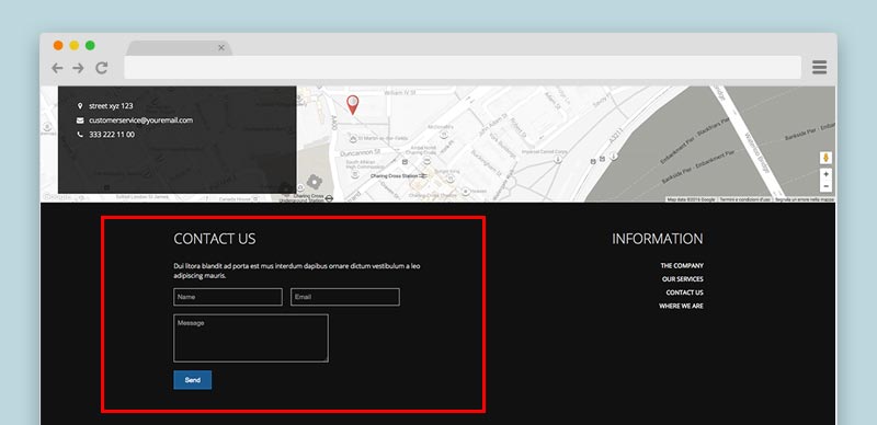
Class Suffix: width50 (please leave a white space before start to write - for more information how to do it, just look the next chapter)
Other Modules
Category module (Latest Events)
This is the Category module of Joomla, the only detail of our override is the Date format of the Display Options tab, that you should modify in this way: Y-m-d H:i:s
LEARNING AND ESCAPE ROOM VIEW:
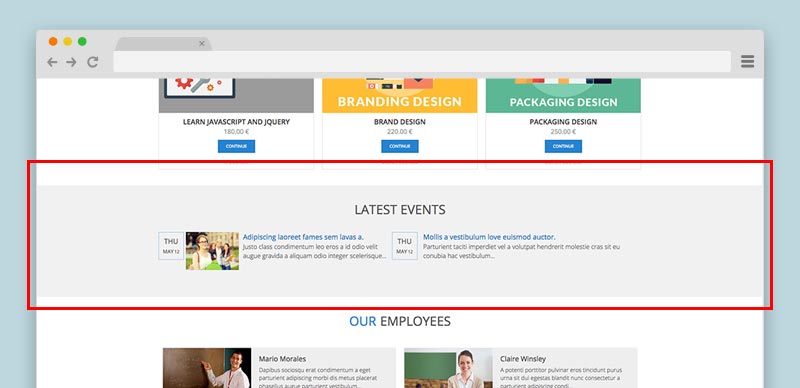
Class Suffix: bg-transp title-center (please leave a white space before start to write - for more information how to do it, just look the next chapter)
WELLNESS CENTER LAYOUT:
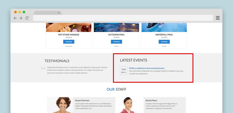
Class Suffix: bg-transp width50 (please leave a white space before start to write - for more information how to do it, just look the next chapter)
Login Module
We use the Basic Login module of Joomla.
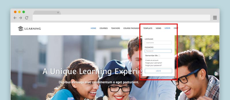
As you can see in our demo website, we used a particular login display, to have this kind of layout, please, follow this instructions:
Class-suffix: loginmenu (please leave a white space before start to write - for more information how to do it, just look the next chapter)
Languages Switcher
To have a multilanguage website you can use the native language manager of Joomla, in our demo website we used the Languages switcher module.
Go to Extensions » Modules Manager. Click on New. Select a Languages switcher
With this module you can choose if you want a dropdown list of your languages or just the little flags listed, we used the dropdown display:
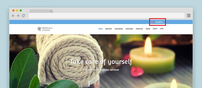
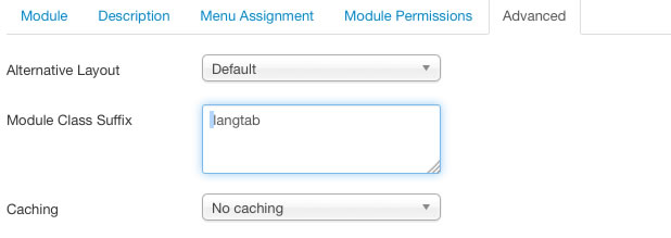
Class-suffix: langtab (please leave a white space before start to write - for more information how to do it, just look the next chapter)
To see how we setup this module in the Back-end: Page 1 - Page 2
Modules Variations
To customize your modules you can use the Class Suffix, in each module you can find somewhere (it depends by the modules but most of the time that field is in the Advacend Options tab), in our case all the class suffix needs to be written with a white space just before type writing, in this way (the light blue color that you could see in this screenshot is a white space leaved before the word "langtab"):
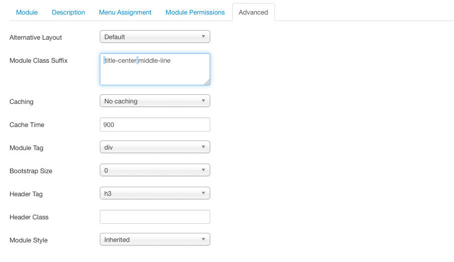
You could also use more than one Class Suffix, to mix more module graphic layouts, an example a centered title with borders (you can read about those class just in the part below of the documentation), in the case that you'd like to mix both the classes you'll always need to leave a white space between them, in this way:
Here the list of the class suffix that you can use with this template, beside you can see their examples:
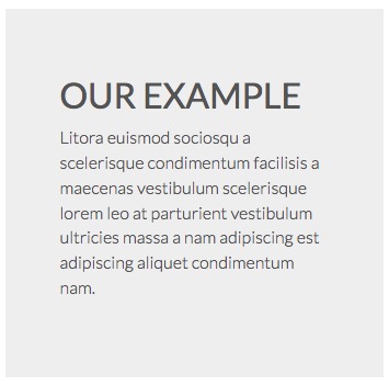
Grey Background
Colors background
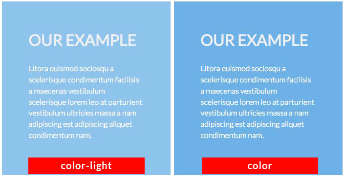
Class-suffix: color-light
Transparent Background
Some template position could have some background color, in the case you'd like to have a transparent background, you could use it an example in the Counter module as we used it in our demo website.
White Background
The White background could be used in some situation where there is a grey or color background and you'd like to use the loadposition and setup a new module hover the other one, an example like we did with the Vik Wall Image and Vik Counter modules.
Title Centered
With this class suffix you are going to center the Title of your module.
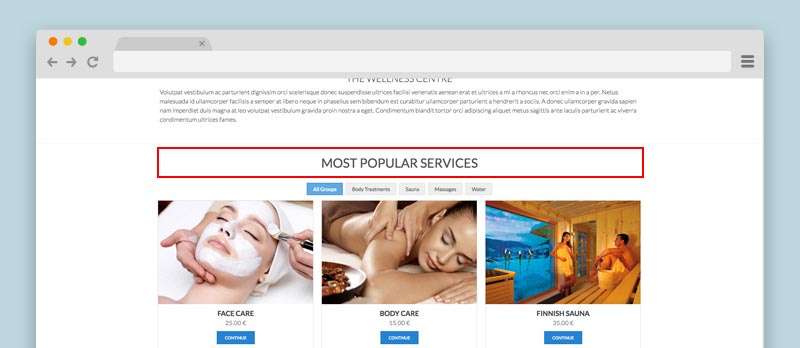
Title Underline
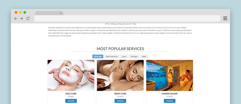
With this class it's possible to have a border line under the title, in our screenshot you could see the "title-center" and the "underline" Class Suffix mixed.
Double color Title
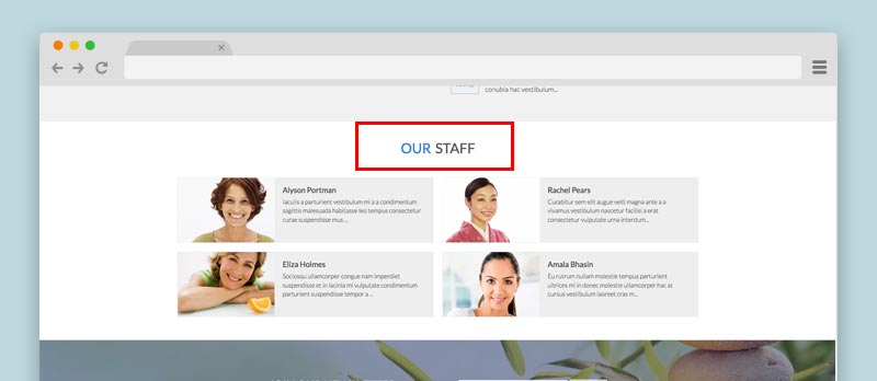
To have the title module with two colors, like our demo website, you have to use two pipes between the two Title parts. (Backend example)
Here the Frontend example:
Title Wrap
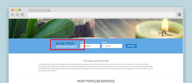
As you can see in the Search module of VikAppointments the title has been splitted up in two rows, to do so you have to use [br] bewteen the two parts, like we have just did when we create the two different colors in the same title module, in this way:
FIND YOUR [br] APPOINTMENT
In our demo website we mixed the double colors combination with the wrap configuration to have half title colored and the other half in a different row, in this way:
FIND YOUR [br] || APPOINTMENT
Here the front-end demo:
Module Top Border
As you could see in our demo website between the text of the main article of the homepage and the VikAppointment Employees module there is a thin grey border, this is a Class Suffix to create a top border for your module:
Modules Width
With this template we use some module classes that you have to setup depending on the layout that you want create. The default width for each module is 100%.
You can use the following class suffix to define the width of your module:
- width100
- width50
- width33
- width25
- width20
Hide module on smartphone
With this Class Suffix you are going to hide a particular module in the smarthphone view.
Internal Pages
Teacher structure
On this template you could find some particular structure, like the Teacher structure in the Service page.

This structure is simple html, you could copy the below code to use it in your website and change the image path (you should copy in the Service description field of VikAppointment):
<div class="course-teacher">
<p>
<img class="img-circle img-left" src="images/english-teacher-small.jpg" border="0" alt="" width="75" />
<strong>Clare Winsley, <em>english teacher</em>.</strong><br />
Aaltrices nunc euismod netus cursus a leo euismod suspendisse phasellus accumsan mus bibendum ac ullamcorper congue.
</p>
</div>
Icons Services Features
Also this structure is just a simple html code:

The icons are an external font library that we use in this template, the icon library is the Awesome Library and you can take a look to all the icons available from this link.
To have the same in your website you have just to copy this code:
<ul class="icon-courses">
<li><i class="fa fa-compass"></i> <span>Level test before arrival</span></li>
<li><i class="fa fa-certificate"></i> <span>School spanish certificate</span></li>
<li><i class="fa fa-support"></i> <span>Tutor support</span></li>
<li><i class="fa fa-gift"></i> <span>Welcome information pack</span></li>
<li><i class="fa fa-book"></i> <span>Study material include in the course</span></li>
<li><i class="fa fa-group"></i> <span>Subscription to all the outdoor activities</span></li>
</ul>
CSS Customizations
From the 1.4 template version has been added the custom.css file to place all your CSS customization. It is recommended to add all your modifications on this file, in this way you'll never lose them, this file will be not overridden in the future template updates.
You can find the file in the panel Extensions > Templates > Templates > e4j Time Details and Files > css > custom.css
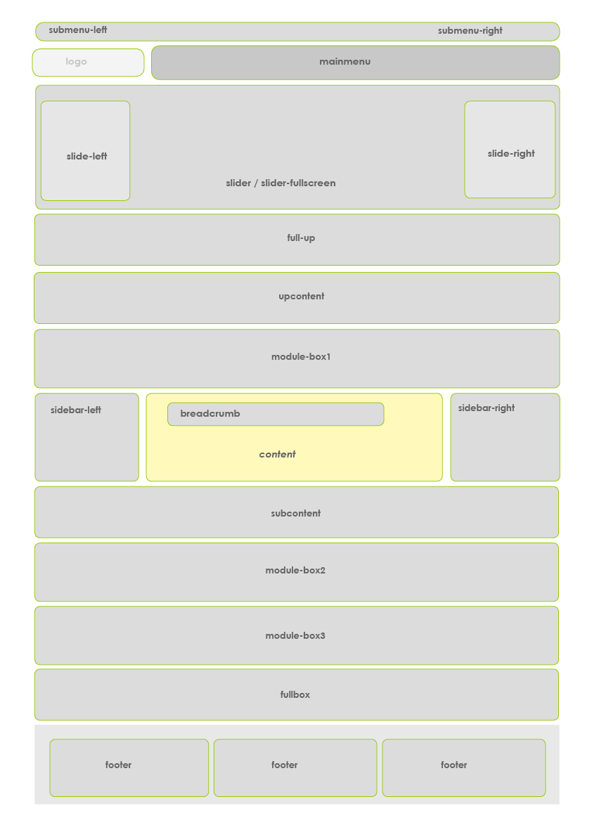
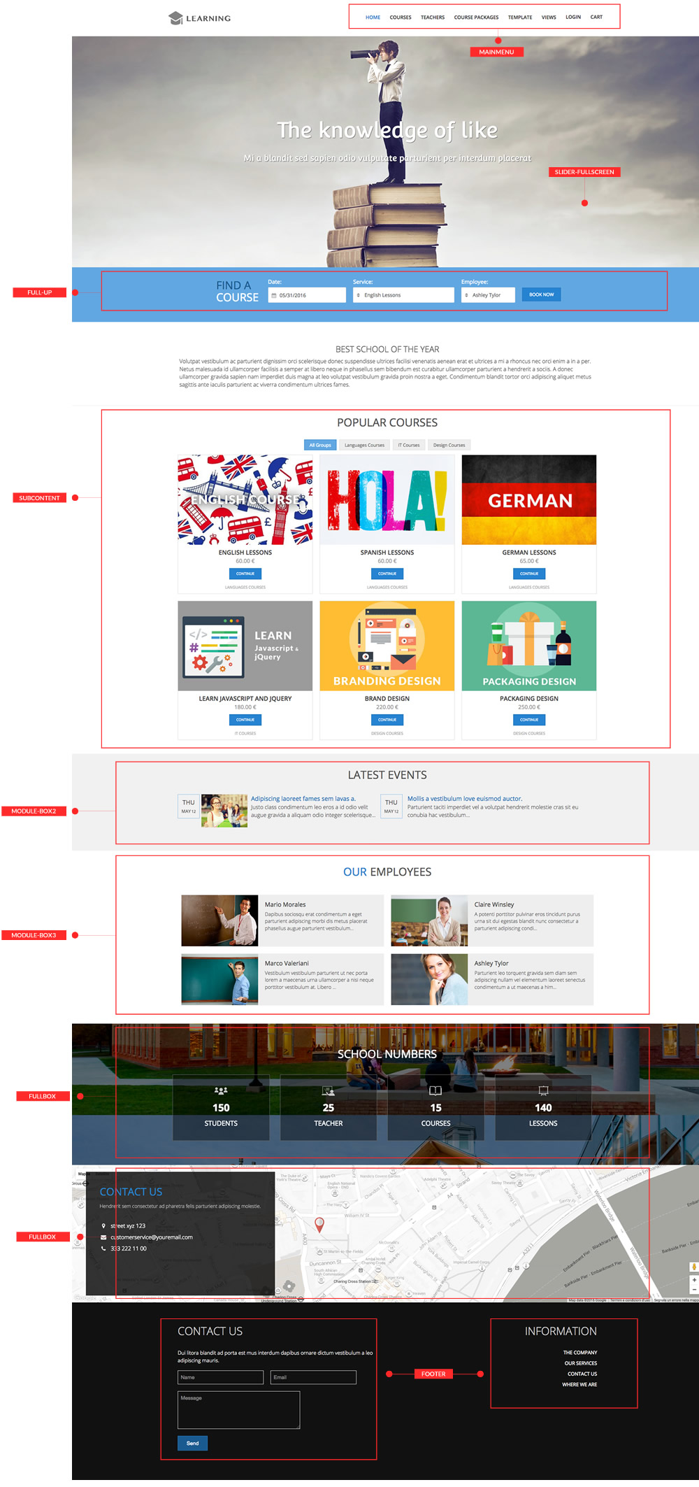
Map Module Positions
Demo website position modules
General troubleshooting
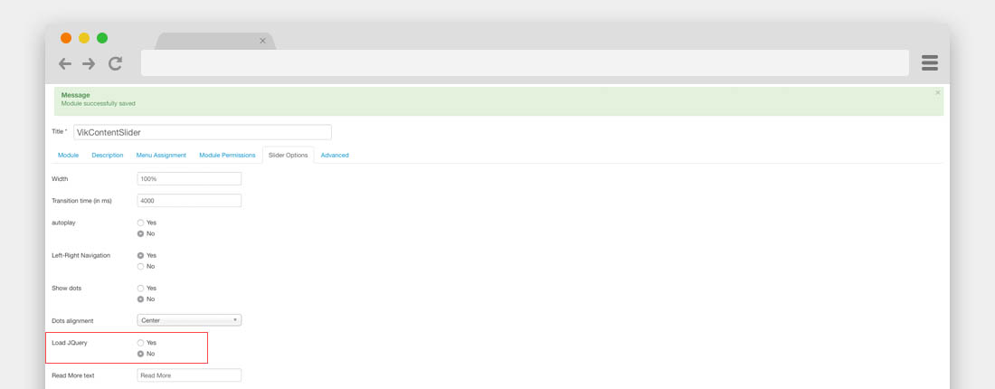
jQuery Conflicts
Sometimes happens, when you'd installed all the modules, that the Vik Content Slider is not working properly or that the calendar of some Vik modules is not working.
In this case your website might have a jQuery Conflicts, it means that too many modules are loading a jQuery library, to solve this problem you have to disable all the Load jQuery parameters in all the Vik Extensions that are enabled, including the Slider module either.
Colors Template
It could be a rare possibility that, if you are using an Hosting with a Windows server or a server that has some particular configuration, it could not be configurate to read correctly the Less library, in this case you could have some problems to see the color variation correctly, to solve this issue you should disable the Less library from the Template Advanced parameters.

Icon problems
Sometimes could happens that if you are using the structure needed from the Awesome icon library you can't see the icons, if you see the code of your editor and can't see the structure anymore it means that the editor of your Joomla is filtring the html code beacuse if find some empty element.
To solve this problem you have to enable the empty element in this way, go to Extensions > Plugins > Editor - TinyMCE
Once you've opened the plugin you have to add in the Extended Valid Elements this code:
i[*]
When you've add this code, you should try again to use the element in your editor and it should work correctly.
Theme Update
To know how to update the template, please, check our Knowledge Base on this link.
