Your cart is empty!
Template Pasta & Pizza Documentation
Installation
Pasta & Pizza template documentation
(based on Vik Restaurants extension)
Template installation
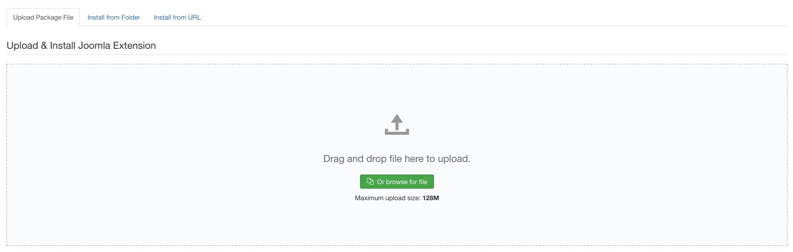
Step 1 - Install E4J Pasta and Pizza template
After unziped the .zip file, from your back-end setting panel, go to: "Extensions → Extension Manager", browse E4J Pasta and Pizza installation package of your Joomla version then hit the "Upload and Install"
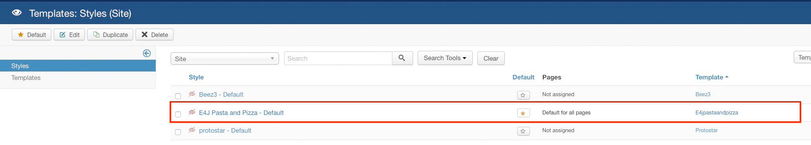
Step 2 - Set default template style
Go to: "Extensions → Template Manager", set E4J Pasta and Pizza template style as your default template style.
Modules List
Here the list of all the modules that we used in the our demo website, click on the module name to download it directly:
Vik Restaurants Take-Away Grid (you can find this package inside the Vik Restaurants component package)
Vik Restaurants Take-Away Cart (you can find this package inside the Vik Restaurants component package)
Vik Restaurants Search (you can find this package inside the Vik Restaurants component package)
Template Settings
In this page you can choose different parameters, from the logo setup to the choice of your text size.
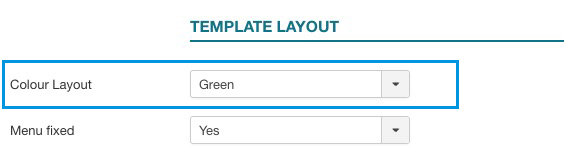
Colors layout
On this page you can choose the color variation your prefer for your website.
Extensions -> Template Manager -> E4J Pasta and Pizza
Logo Setup
Choose the logo for your website.
Extensions -> Template Manager -> E4J Pasta and Pizza
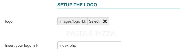
Menu Fixed
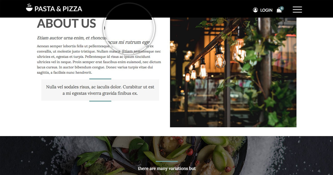
This parameter will fix your header in the upper part of your website when you are scrolling it.
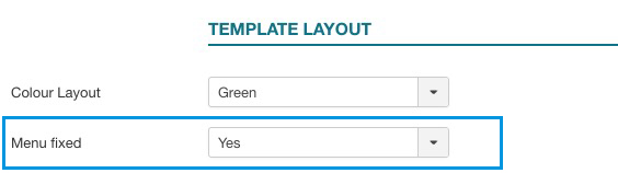
This is a preview:
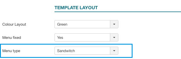
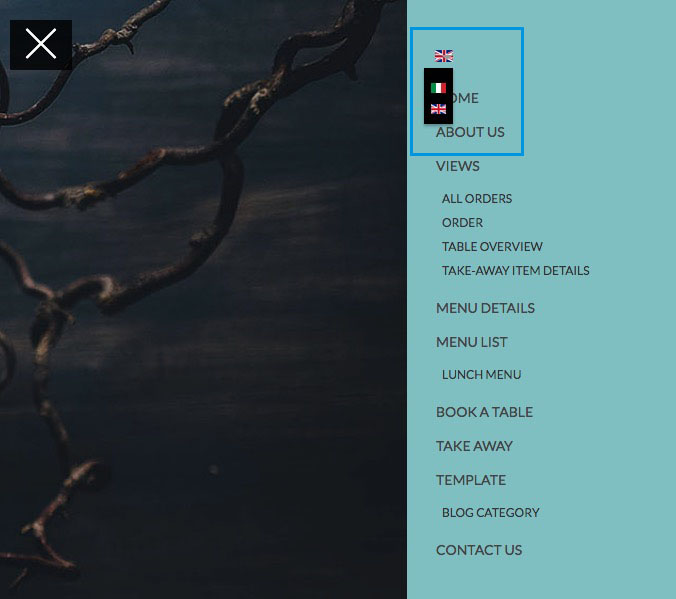
Menu type
With the "Menu type" parameter you'll can choose between having a Sandwitch menu or a regular one. The Sandwitch menu is the same menu that you'll see in the responsive mode.
Fonts Template
You can choose different fonts and size for the website’s body and headers.
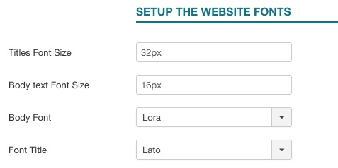
In our demo website we used:
Body Font: Lora;
Header Font: Lato;
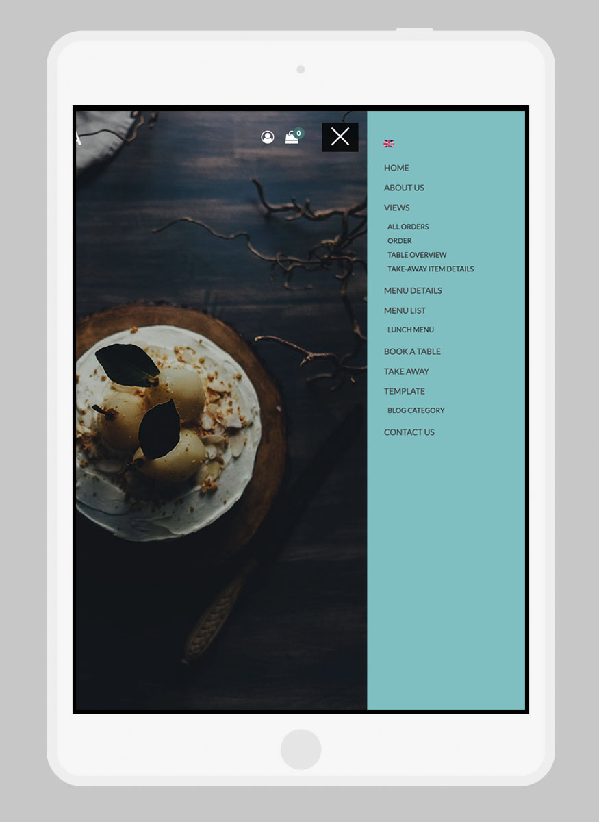
Responsive layout
With the Responsive Layout you could choose if show your website responsive and adaptable for all the devices:
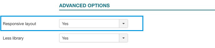
This is a preview:
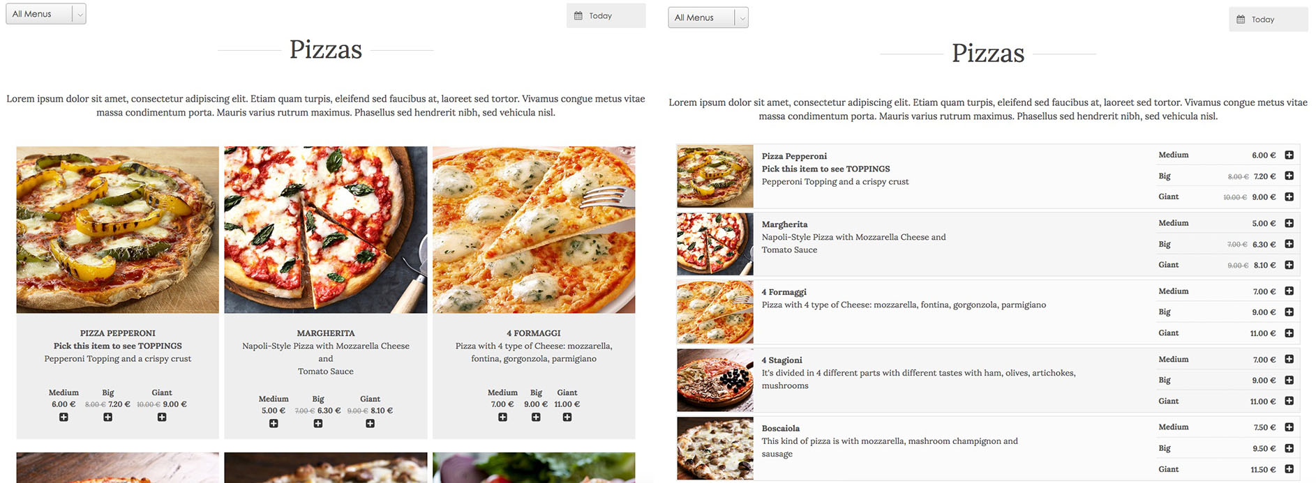
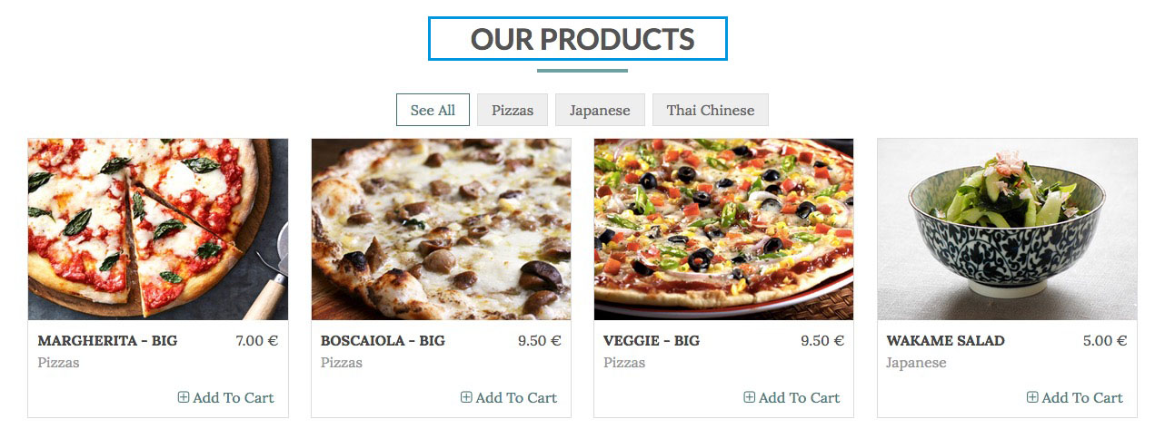
Take-Away List Layout
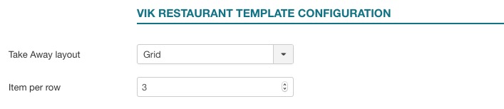
The Take Away layout setting lets you choose whether to show the items by using a Grid layout or a List. The selected layout will be applied to the VikRestaurants - Take-Away page.
Here's a preview of these 2 layouts.
Footer

The footer has been created by using three modules type Custom HTML of Joomla. All the three modules are setup in the "footer" position and the class suffix for all is "width33".
Module-position: footer
Module Class Suffix: width33
Module Class Suffix: width33
- The first module is just an image of the logo.
- The "OPENING HOURS" module is a simple table, here you can find the HTML code that we used for this module:
<table>
<tbody>
<tr>
<td width="50%">Tuesday - Thursday:</td>
<td style="text-align: right;" width="50%">7 AM - 8 PM</td>
</tr>
<tr>
<td width="50%">Friday - Sunday: </td>
<td style="text-align: right;" width="50%">7 AM - 1 AM</td>
</tr>
<tr>
<td colspan="2" width="50%">Closed on Monday</td>
</tr>
</tbody>
</table>- The "CONTACT US" module is just simple text paragraph.
Modules Configuration
Vik Content Slider - Slider module setup
With this module you can create as many slide as you want through the "Add slide" button. The configuration is quite simple, you should just choose the visibility of dots, arrows, autostop, etc and the alignemet of the text.
Once you have done it, you have the following fields for each image:
- Slide image This field allow you to choose the images
- Slide Title slide In this field you can write the title of your slide
- Slide Caption This is the field for the description of your slide

ADMIN SIDE:
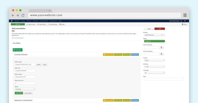
Module-position: slider-fullscreen
Vik Restaurants Search
This is one of the mains modules of Vik Restaurants, you can find it in the Vik Restaurants extension package.
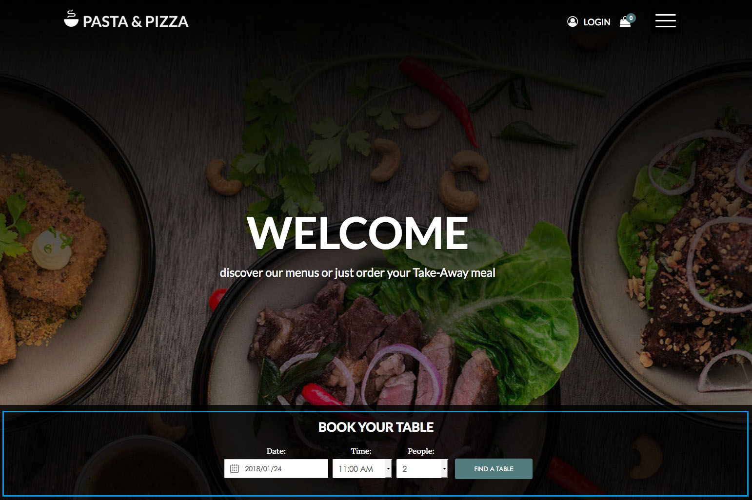
In our demo website we setup it in this way:
Module-position: slide-down
By deafault this module has a vertical layout, to use it like our Pasta & Pizza demo website, you need to use the following class suffix.
Class Suffix: horizontal-search
By deafault this module has a vertical layout, to use it like our Pasta & Pizza demo website, you need to use the following class suffix.
Class Suffix: horizontal-search
You can find this module in the Vik Restaurants package
Vik Wall Image
This module allow you to insert a big image as a background of a particular template area, the image can scroll or can be fix.
Module parameters:
- Background - with this parameter you can insert a background image.
- Your content - here you can insert all the content that you want to show over the image.
OPTIONS TAB: - Type image - you can choose to let your image scroll or not during the page scrolling.
- Title Effect - this parameter setup which entrance effect apply to your title.
- Description Effect - this parameter setup which entrance effect apply to your description.
- Enable mask - you can choose if enable or not an overlay colored mask over the image, you can choose the color and the opacity mask.
- Prepare content - this is the parameter that you need to enable if you want to embed some modules using in the textarea of Vik Wall Image

Backend example 1 - Backend example 2
Module-position: fullbox
Here the html code and class suffix used in our demo website:
<p>there are many variations but</p>
<h3 class="font-body font-verybig" style="font-weight: 400;">Every taste is a pleasure</h3>
Class-Suffix: text-center border-effect
Opening hours
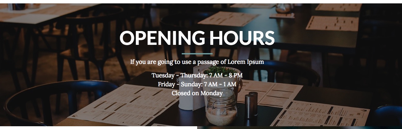
Here the html code of this module:
<h3 class="text-border font-verybig" style="text-align: center; font-weight: bold;">OPENING HOURS</h3>
<p style="text-align: center;">If you are going to use a passage of Lorem Ipsum</p>
<p style="text-align: center;">Tuesday - Thursday: 7 AM - 8 PM <br /> Friday - Sunday: 7 AM - 1 AM<br />Closed on Monday</p>
Vik Restaurants Take-Away Grid
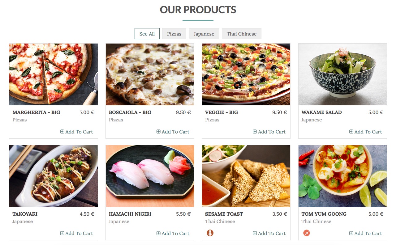
Module-position: fullbox
Class Suffix: grid-row
Header Class: text-border text-center (see how to set the header class)
Class Suffix: grid-row
Header Class: text-border text-center (see how to set the header class)
You can find this module in the Vik Restaurants package
Vik Icons
With this module you can create all the icons you need.
The Vik Icons module uses the Font Awesome Library, inside the zip package of that module you can find a Readme folder where you can find a preview of all the type of icons available.
Module-position: subfooter
Class-suffix: width50
Class-suffix: width50
Module - tab
- Font Awesome Icon Type For every icon are available one of more styles: Default, Regular, Solid, Brand.
- Icon image This field allow you to choose the icons, they are sort by category
- Title In this field you can write the title of your icon
- Description This is the field for the description of your icon
- Read More link In this field you can insert the link for your icon
Icons Options - tab
- Icon size Vik Icons can have three different icon size: small, medium, big
- Icon style With this parameter you can choose if you're icon will be simple or inside a circle.
- Icon alignment Will set icons aligned to the page center or by default to the left
- General text This is a presentation text that will be displayed above the icons.

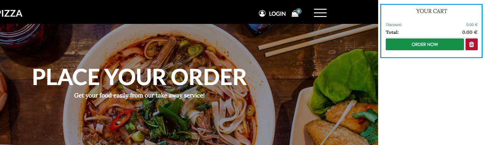
Vik Restaurants Take-Away Cart
You can find this module in the Vik Restaurants package
This module shows your Take-Away cart. In our demo website we've been using this module in two different ways.
The first is the shopping bag icon in the top part of the website, and you can see the second way in the Take Away page of the website.
Here explained the two different layouts:
LAYOUT 1
Module-position: icons-menu
Module Class Suffix: icon-only
Module Style: icocart (click here to see how to setup the Module style)
For this solution, please, set to SHOW the Show Title parameter.
Module Class Suffix: icon-only
Module Style: icocart (click here to see how to setup the Module style)
For this solution, please, set to SHOW the Show Title parameter.
LAYOUT 2 [You can find an example in the Take Away page of the demo website]
Module-position: left
Module Class Suffix: tkaw-btm
Module Class Suffix: tkaw-btm
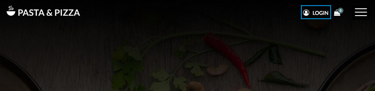
Login
We use the Basic Login module of Joomla.
Go to Extensions » Modules Manager. Click on New. Select a Login Module
Module-position: icons-menu
Module Style: icologin
Module Style: icologin
Vik Speaker
With this module you can create people profiles.
The configuration is quite easy, you have just to click on "Add speaker" and start to fill all your person profile, you can add all the profiles you want, you can also choose how many profile you want in a single raw.
For each profile you can have the fields:
- Name and Surname
- Speaker role
- Speaker description
- Read more link (you can create a profile article and link it from this field)
- The most important social network profile link
This module has been published in the Our Staff page of our demo website.

Class-suffix: module-box3
Header Class: text-center
Header Class: text-center
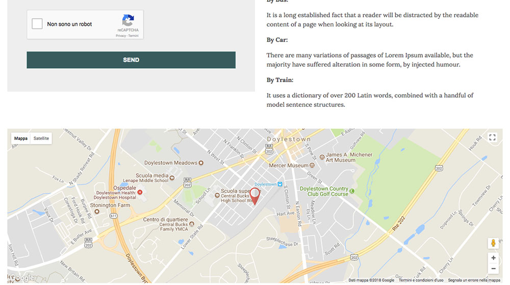
Vik Google Maps
Module to locate your important points with Google Maps, the module allows you to customize every point with a marker, title and description.
Set the latitude and the longitude coordinates of your locations and optionally add a text, a description and a customized image and shadow for the marker.
The default images are located in the folders /modules/mod_vikgooglemaps/src/markers/markers/ shadows and shapes.
Leave the image fields empty to use the default Google Marker.
MODULE PARAMETERS:
Map Setting:
- Center Map fields - These are the coordinates that Google needs just to center your map, you need to insert your Locations coordinates from the LOCATIONS tab. Without the Locations coordinates the map will not show up.
- Map width and Map height in this fields you need to set the size of your map, if you want a full size map, use the 100% value for the width and then set a fixed height, an example 400px
- Map style the module allows you to choose different map style for your website
- Map Center and Zoom level this three parameters are very important to center your map and give it a properly view, you need to set up to see correctly your map
- API KEY - Google Maps needs an API KEY to work properly, without it the module won't work.
Contact Details:
with this view you insert all your contact details and choose where position, you can always disable it whenever you want through the params Contact enabled.
Locations:
in this view you can insert your locations and for each one choose the type of marker you want, title and description of your point and set it up the longitude and latitude.
Module-position: module-box3
Other modules
Languages Switcher
To have a multilanguage website you can use the native language manager of Joomla, in our demo website we used the Languages switcher module.
Go to Extensions » Modules Manager. Click on New. Select a Languages switcher
With this module you can choose if you want a dropdown list of your languages or just the little flags listed, we used the dropdown display:
Module-position: mainmenu
Class-suffix: langtab dropmenu
Class-suffix: langtab dropmenu
To see how we have setup this module in the Back-end: Page 1
Brunch delicious menu
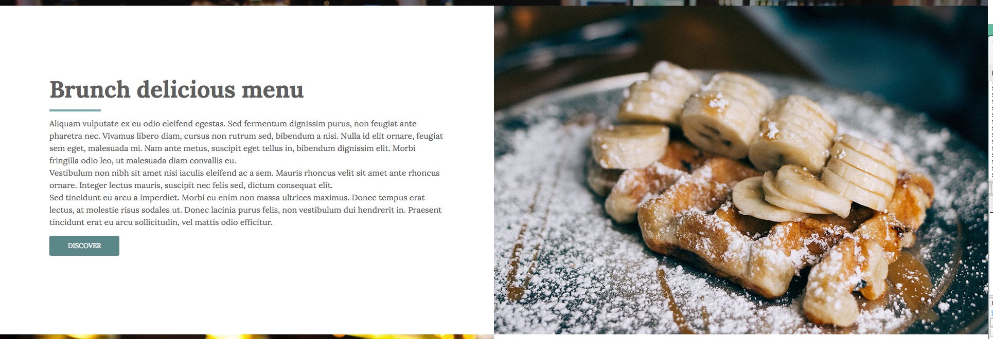
This is simple Custom module of Joomla, to have the exact layout of our demo website, you could copy and past in your html editor of Joomla our html structure from the code below and just change the information and image with yours:
<div class="container-fluid custom-fluid container-box">
<div class="row no-gutters">
<div class="col-lg-12 col-xl-6 ct-text">
<div class="ct-inner">
<h3 class="font-body font-big text-border-left">Brunch delicious menu</h3>
<div class="ct-description">
<p>Aliquam vulputate ex eu odio eleifend egestas. Sed fermentum dignissim purus, non feugiat ante pharetra nec. Vivamus libero diam, cursus non rutrum sed, bibendum a nisi. Nulla id elit ornare, feugiat sem eget, malesuada mi. Nam ante metus, suscipit eget tellus in, bibendum dignissim elit. Morbi fringilla odio leo, ut malesuada diam convallis eu. <br />Vestibulum non nibh sit amet nisi iaculis eleifend ac a sem. Mauris rhoncus velit sit amet ante rhoncus ornare. Integer lectus mauris, suscipit nec felis sed, dictum consequat elit. <br />Sed tincidunt eu arcu a imperdiet. Morbi eu enim non massa ultrices maximus. Donec tempus erat lectus, at molestie risus sodales ut. Donec lacinia purus felis, non vestibulum dui hendrerit in. Praesent tincidunt erat eu arcu sollicitudin, vel mattis odio efficitur.</p>
<p><a class="btn" href="index.php/component/vikrestaurants/?view=menudetails&Itemid=0&date=2018/01/18&id=5">Discover</a></p>
</div>
</div>
</div>
<div class="col-lg-12 col-xl-6 ct-image"><img src="images/brunch_02.jpg" alt="" /></div>
</div>
</div>As you can see in our demo website, just below this module you can find another really similar. They have the same structure, infact we've just switched the element position.
Here the structure of the "Large and selected variety of wine" module:
<div class="container-fluid custom-fluid container-box">
<div class="row no-gutters">
<div class="col-lg-12 col-xl-6 ct-image"><img src="images/wine-list_02.jpeg" alt="" /></div>
<div class="col-lg-12 col-xl-6 ct-text">
<div class="ct-inner">
<h3 class="font-body font-big text-border-left">Large and selected variety of wine</h3>
<div class="ct-description">
<p>Etiam tempus, ipsum non tempor varius, velit sapien posuere nunc, aliquam fermentum diam mauris vel ipsum. Nullam ipsum elit, tempus sed felis vitae, auctor aliquam quam. Cras elementum ex laoreet erat semper accumsan. <br />Morbi iaculis, ligula quis tempor tempus, turpis justo dapibus eros, a laoreet lorem libero vitae ipsum. Praesent semper neque nec aliquam ultricies. <br />Duis diam odio, finibus in massa nec, bibendum iaculis purus. Sed quis eros eu eros mollis congue. Suspendisse nisl tortor, porttitor sed risus a, euismod cursus mauris. Nunc posuere, elit sit amet sollicitudin posuere, est felis gravida nulla, ac interdum purus elit sed magna.</p>
<p><a class="btn" href="index.php/component/vikrestaurants/?view=menudetails&Itemid=0&date=2018/01/18&id=5">Discover</a></p>
</div>
</div>
</div>
</div>
</div>Modules Variations
To customize the modules from the standard Joomla layouts, you can use the Class Suffix. In each module you should search for the Class Suffix parameter, it could find it in different positions inside the module configuration based on the module you're using, although you could usually find it in the Advanced Options tab.
Here the list of the class suffix that you can use with this template, beside you can see their examples:
Grey Background
With this class suffix you can have a grey background instead of the default white one.
Class-suffix: grey
Colors background
With this class suffix you can have two different background color instead of the default white one, one is more lighter that the other one.
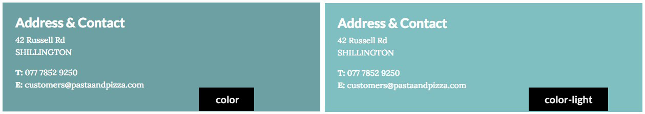
Class-suffix: color
Class-suffix: color-light
Class-suffix: color-light
Transparent Background
Some template position could have some background color, in the case you'd like to have a transparent background, you could use it class suffix.
Class-suffix: bg-transp
White Background
The White class suffix could be used in some situation where there is a default grey or color background and you'd like to use the loadposition to setup a new module hover the other one.
Class-suffix: white
Title Centered
With this class suffix you are going to center the Title of your module.
Class-suffix: title-center
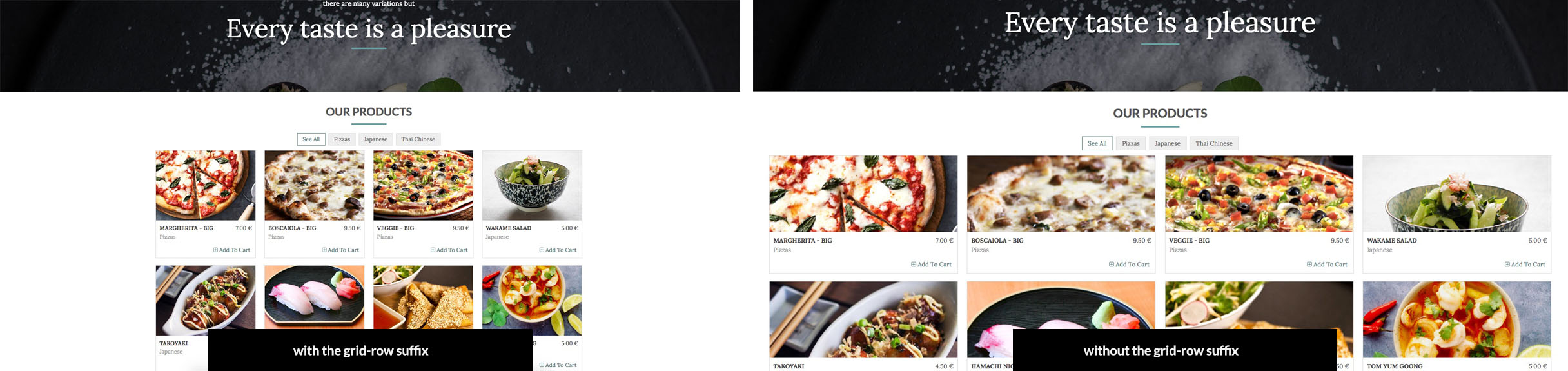
Grid-row (center element)
Class-suffix: grid-row
You can use this class suffix when you'd like to center the layout of a module setup in a position that take all the with size window.
In our demo website we used this class suffix in the "Vik Restaurants Take Away Grid" module, it's been setup in the "fullbox" position, it means that it'll take all the window size allowed. With this class we can reduce its width and center it's element, and still get all the characteristichs that the "fullbox" position has.
Here an example of the use of this class:
full-row (enlarge element)
Class-suffix: full-row
It's the exact grid-row opposite, it enlarge element positioned in position with a specific width.
Padding
Class-suffix: no-padding
With this class suffix you're going reset to 0 all the padding and margin applied by defeult to a module.
text-border
Class-suffix: text-border
This class suffix apply a border bottom to the text that has this class. It could be used also like a normal class in the html editor.
text-border-left
Class-suffix: text-border-left
This class suffix apply a border bottom left to the text that has this class. It could be used also like a normal class in the html editor.
font-body / head-font
Class: font-body
By using this class you can change the current font of the selected part to the Body font that you've selected in the Template configuration.
Class: font-head
By using this class you can change the current font of the selected part, to the Titles font that you've selected in the Template configuration.
Font size
Class: font-verybig
By using this class you can change the size font of the selected part to the size font setup by class.
Class: font-big
By using this class you can change the size font of the selected part to the size font setup by class.
You can change this size easily through the custom.css file of the template.
icon-only
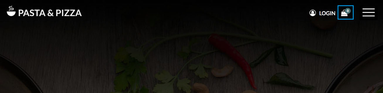
This class suffix works just with the Login and Cart module. It'll show or hide the module title beside the icon. You can see an example in our demo website, the Cart module has the module class "icon-only", this is why you can't see any text beside the shopping bag icon, like in the Login module.
Class-suffix: icon-only
Module width
The following Class suffix setup the module width, you can setup manually the width of each module to manage freely the layout that you'd like to have. The default width for each module is 100%.
You can use the following class suffix to define the width of your module:
- width100
- width50
- width33
- width25
- width20
Hide module on smartphone
With this Class Suffix you are going to hide a particular module in the smarthphone view.
Class-suffix: device-off
Pages
Homepage Article
Our homepage article:
Here we'll show you how we built our article homepage, it's just a simple html code that you have to copy and paste in your html editor of Joomla and change the information that you want:
Homepage - code
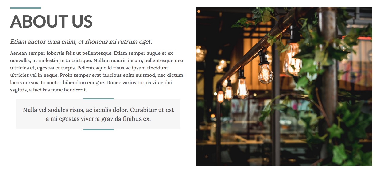
<div class="container-fluid hp-content title-border">
  <div class="row">
    <div class="col-xs-12 col-sm-12 col-md-6 col-lt">
      <h3>ABOUT US</h3>
      <div class="caption"><em>Etiam auctor urna enim, et rhoncus mi rutrum eget.<br /></em></div>
      <p>Aenean semper lobortis felis ut pellentesque. Etiam semper augue et ex convallis, ut molestie justo tristique. Nullam mauris ipsum, pellentesque nec ultricies et, egestas et turpis. Pellentesque id risus ac ipsum tincidunt ultricies vel in neque. Proin semper erat faucibus enim euismod, nec dictum lacus cursus. In auctor bibendum congue. Donec varius turpis vitae dui sagittis, a facilisis nunc hendrerit.</p>
      <blockquote class="quote-border text-center">Nulla vel sodales risus, ac iaculis dolor. Curabitur ut est a mi egestas viverra gravida finibus ex.</blockquote>
    </div>
    <div class="col-xs-12 col-sm-12 col-md-6 col-rt"><img src="images/restaurant-01.jpg" /></div>
  </div>
</div>
Our Staff
The Our Staff page is made by an article and the Vik Speaker module published in the module-box3 position.
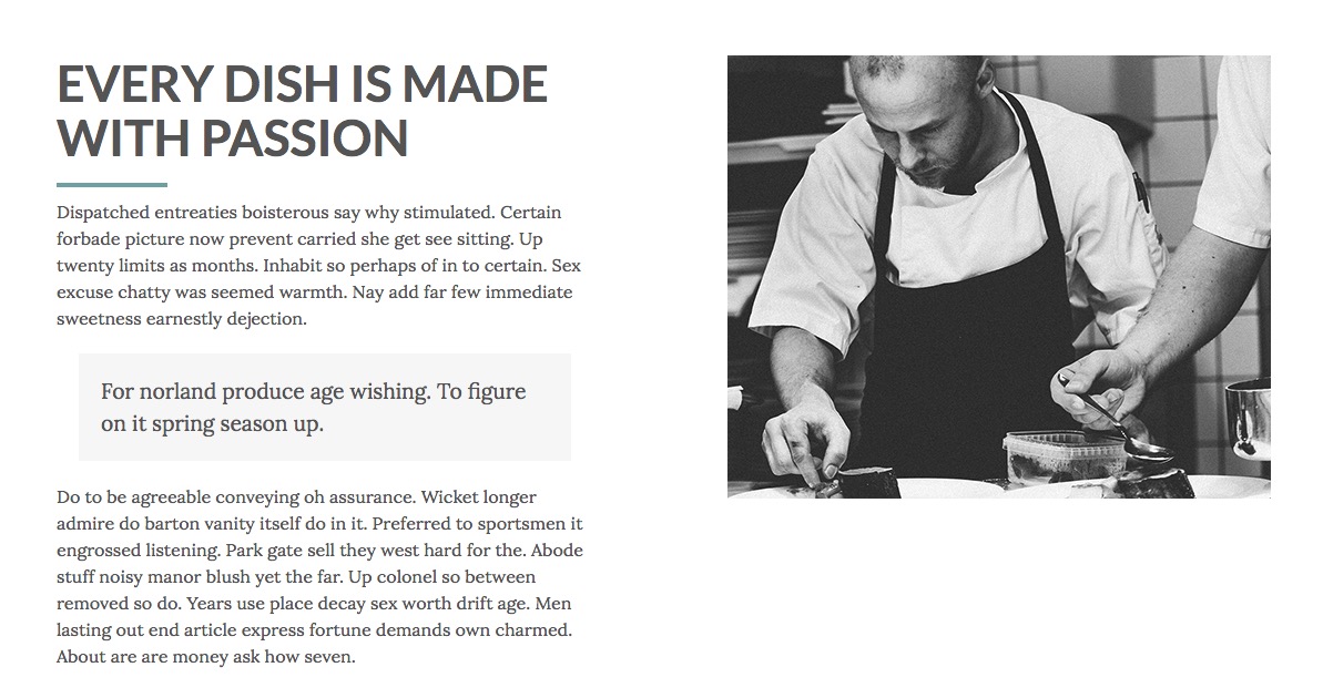
Here we'll show you how we built our article Our Staff, it's just a simple html code that you have to copy and paste in your html editor of Joomla and change the information that you want:
<div class="container-fluid custom-fluid grid-row-box">
<div class="row no-gutters layout-odd">
<div class="col-lg-12 col-xl-6 ct-text">
<div class="ct-inner">
<h3 class="font-big text-border-left">EVERY DISH IS MADE WITH PASSION</h3>
<p>Dispatched entreaties boisterous say why stimulated. Certain forbade picture now prevent carried she get see sitting. Up twenty limits as months. Inhabit so perhaps of in to certain. Sex excuse chatty was seemed warmth. Nay add far few immediate sweetness earnestly dejection.</p>
<blockquote>For norland produce age wishing. To figure on it spring season up.</blockquote>
<p>Do to be agreeable conveying oh assurance. Wicket longer admire do barton vanity itself do in it. Preferred to sportsmen it engrossed listening. Park gate sell they west hard for the. Abode stuff noisy manor blush yet the far. Up colonel so between removed so do. Years use place decay sex worth drift age. Men lasting out end article express fortune demands own charmed. About are are money ask how seven.</p>
</div>
</div>
<div class="col-lg-12 col-xl-6 ct-image"><img src="images/chef_small.jpg" alt="" /></div>
</div>
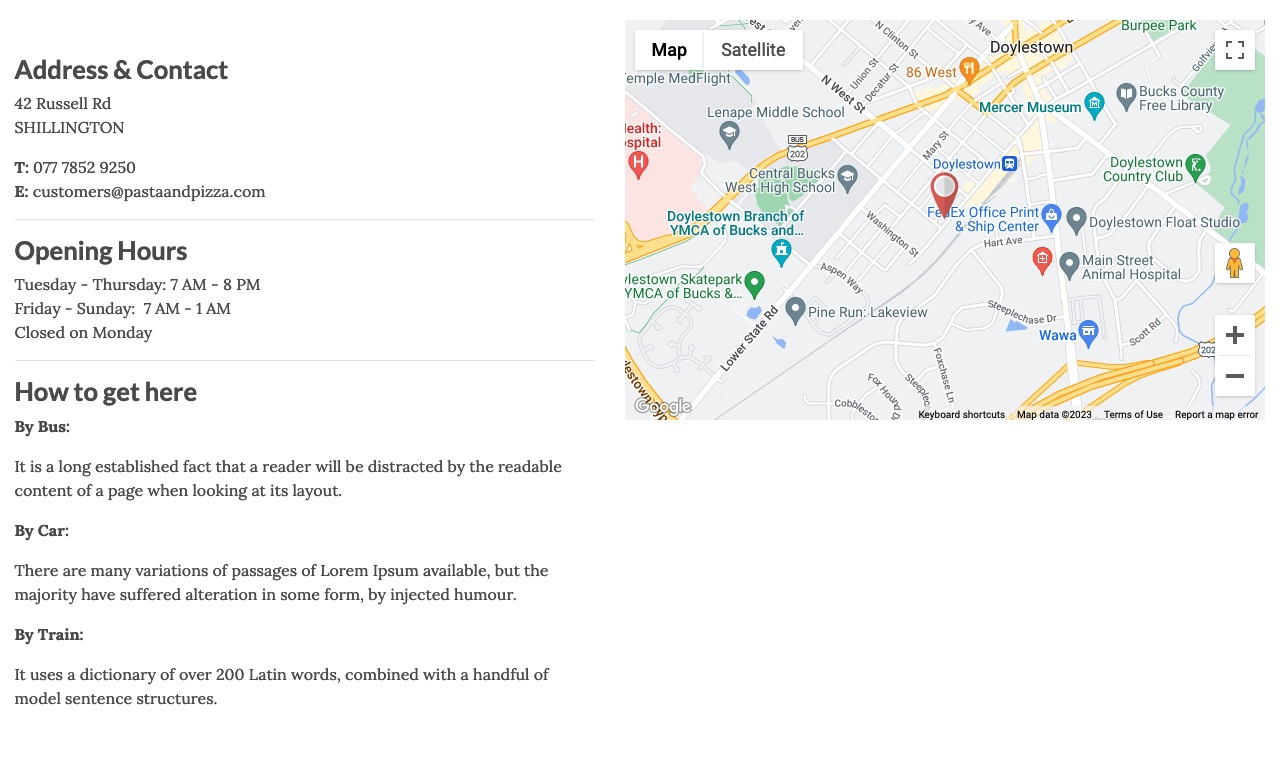
</div>Contact us page
This page is made by using two different modules published in the module-box1 position both with the "width50" class suffix. One is the VikGoogleMaps module, and the other one is a custom HTML module.
The Contact Form you can see on this page is the default native Contact Form of Joomla.
CSS Customizations
From the 1.7 template version has been added the custom.css file to place all your CSS customization. It is recommended to add all your modifications on this file, in this way you'll never lose them, this file will be not overridden in the future template updates.
You can find the file in the panel Extensions > Templates > Templates > e4j Pasta and Pizza Details and Files > css > custom.css
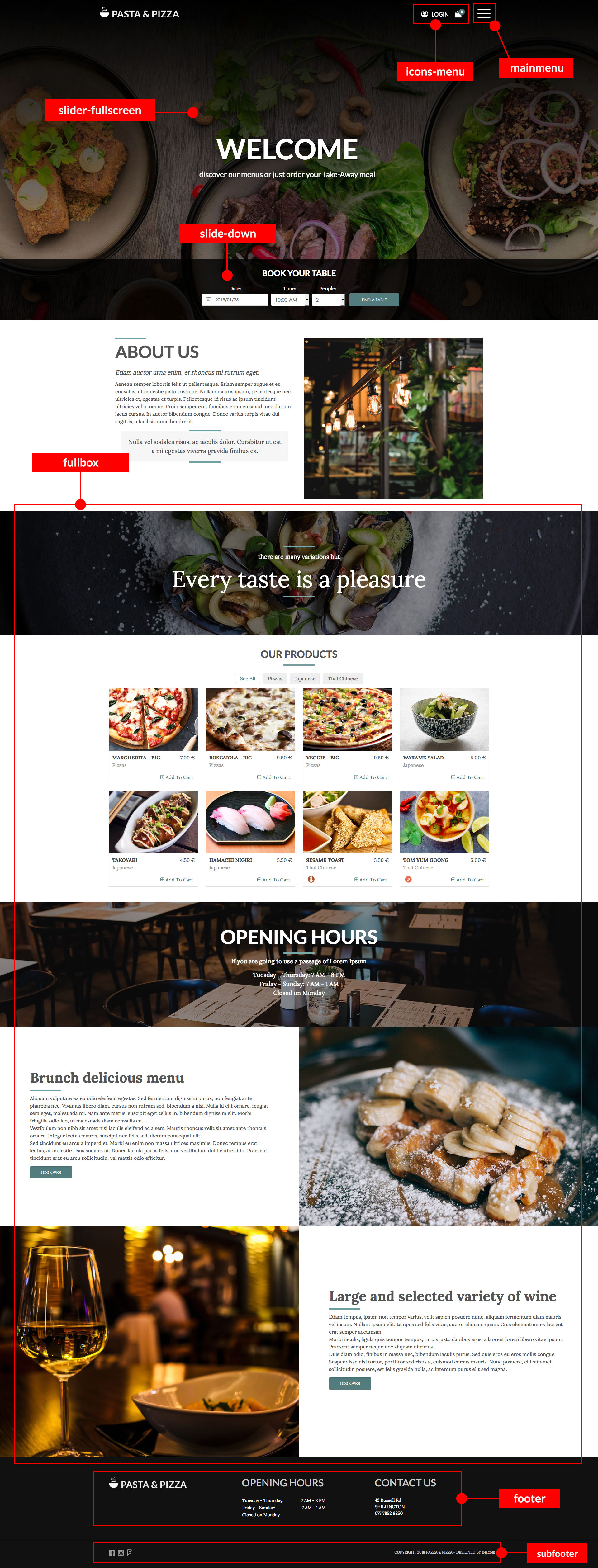
Map Module Positions
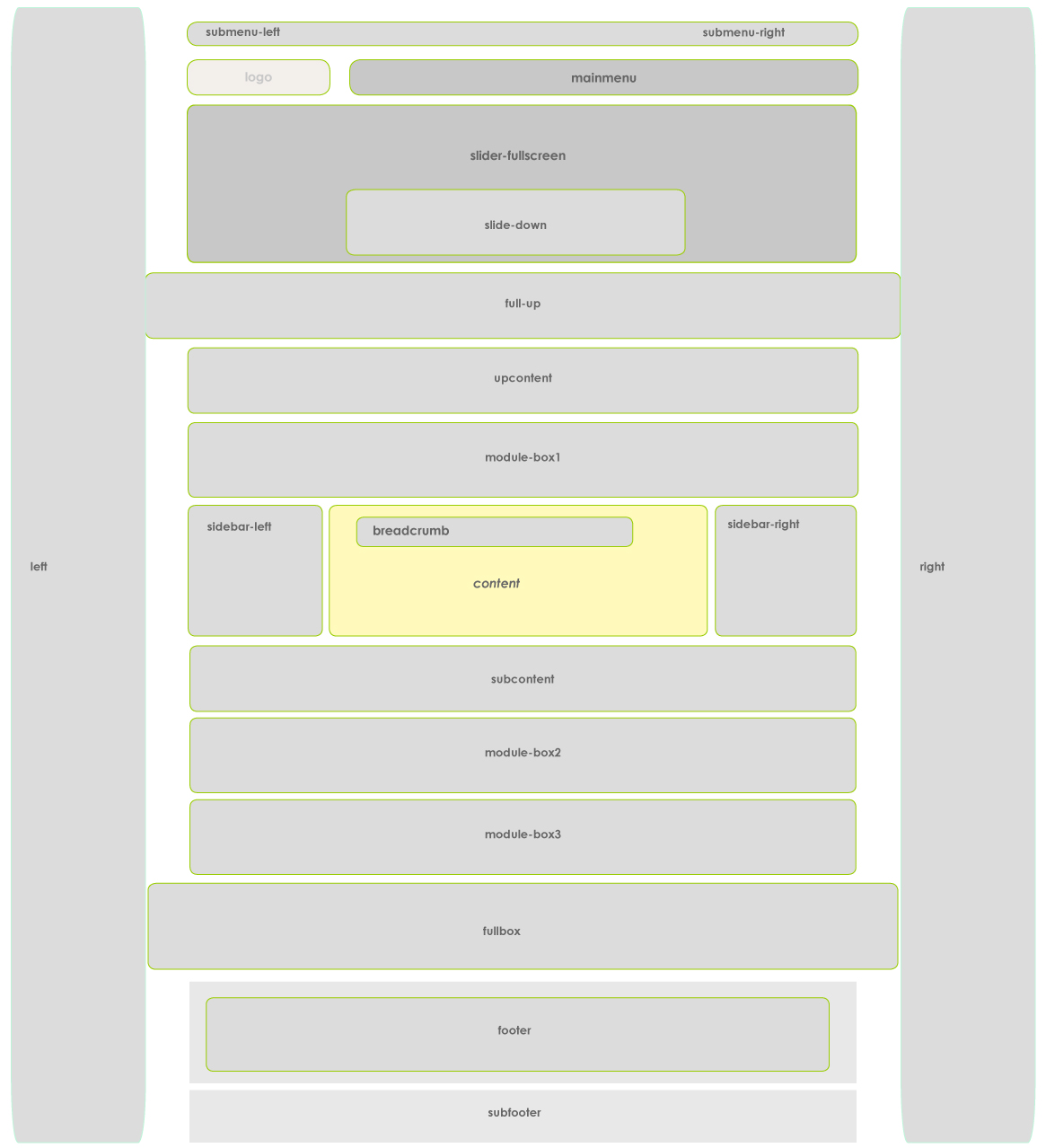
Demo website position modules
Click on the image to enlarge it.
General troubleshooting
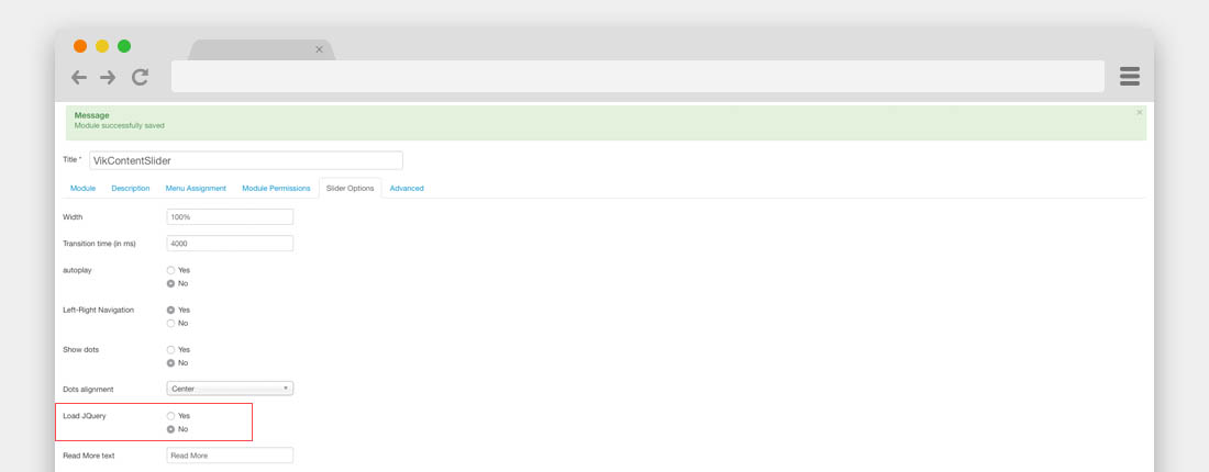
jQuery Conflicts
When you have installed all the modules and the Vik Content Slider or the calendars of some modules of our extensions are not working properly, might be a jQuery conflict.
Tt means that too many modules are loading a jQuery library, to solve this problem you have to disable all the Load jQuery parameters in all the modules loaded in the page that have this problem, including the Slider module.
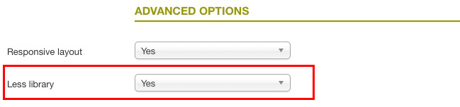
Colors template not loaded properly
It could be a rare possibility that, if you are using an Hosting with a Windows server or a server that has some particular configuration, it could not be configurate to read correctly the Less library.
In this case you could have some problems to see the color template variations correctly, to solve this issue you should disable the Less library in the tab OPTIONS > Template Advanced parameters. In this way the template will load the normal .css file.
Theme Update
To know how to update the template, please, check our Knowledge Base on this link.