Your cart is empty!
Template BoxOffice Documentation
Template BoxOffice
BoxOffice template documentation
(based on VikEvents extension)
Installation
Template installation
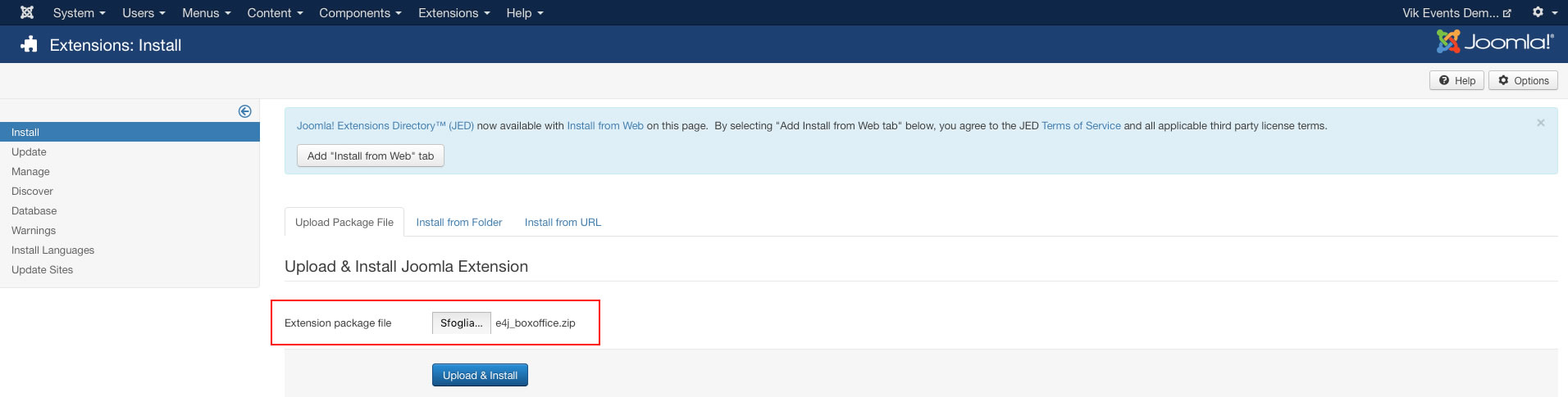
Step 1 - Install E4J BoxOffice template
After unziped the .zip file, from your back-end setting panel, go to: "Extensions → Extension Manager", browse E4J BoxOffice installation package of your Joomla version then hit the "Upload and Install"
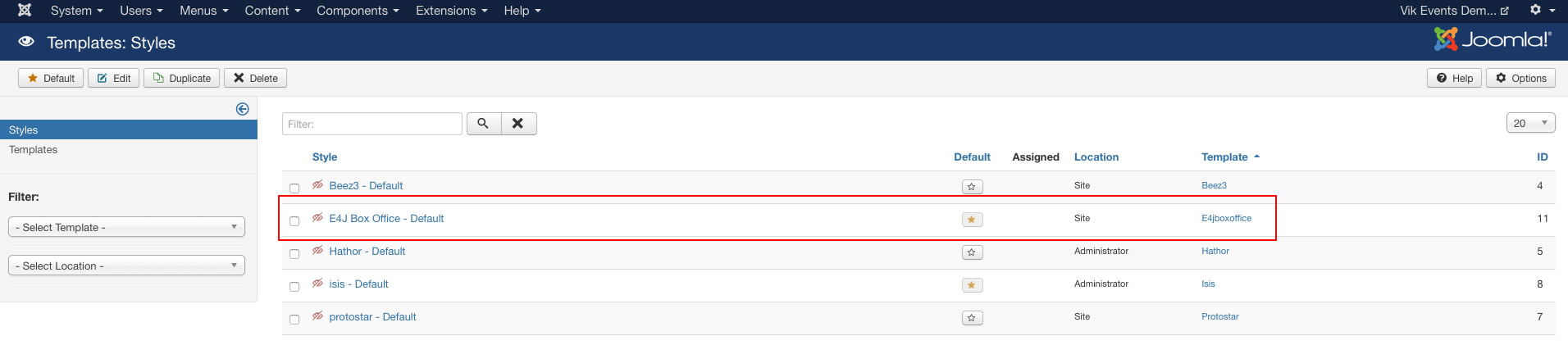
Step 2 - Set default template style
Go to: "Extensions → Template Manager", set E4J BoxOffice template style as your default template style.
Install all the modules
Here the list of all the modules that we used in the our demo website :
Vik Events - Upcoming (you can find this package in the Vik Events component package)
Vik Events Cart (you can find this package in the Vik Events component package)
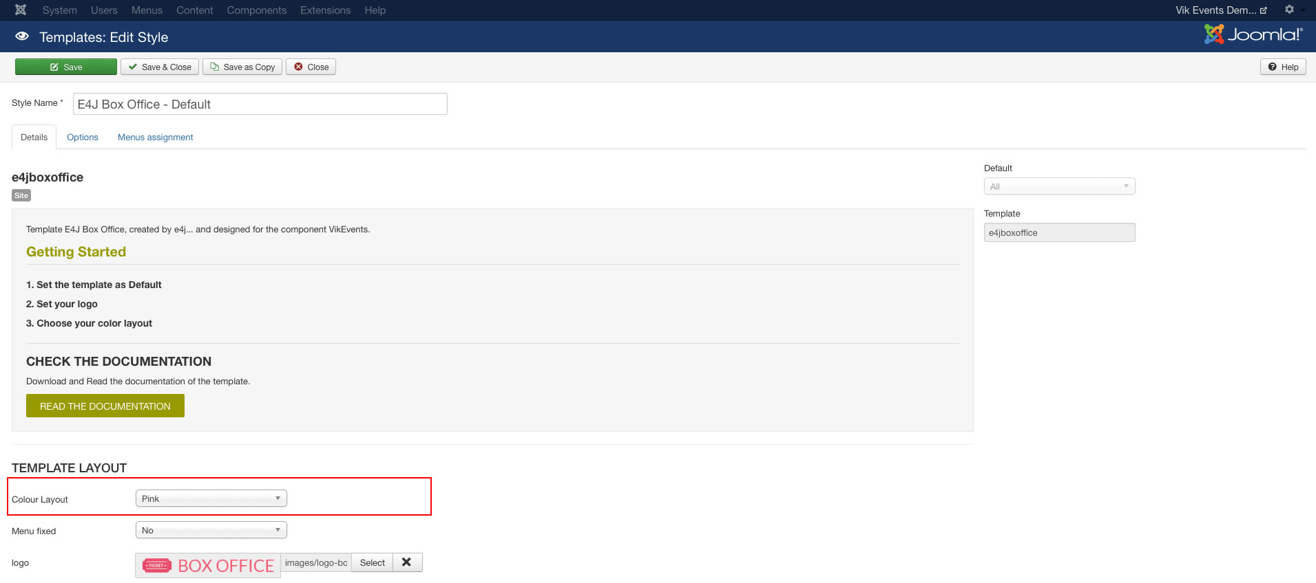
Template settings
In this page you can choose different parameters, from the setup of your logo to choose the size of your text.
Extensions -> Template Manager -> E4J Box Office
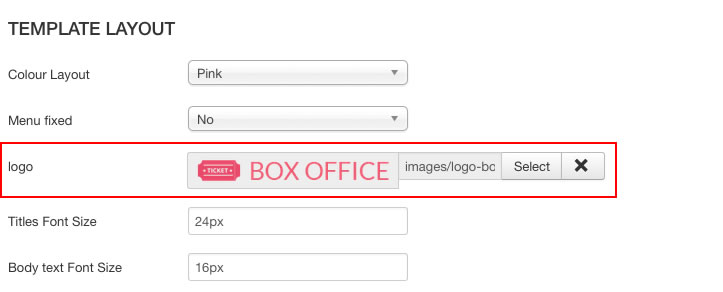
In this page you can choose the color variation your prefer for your website.
Extensions -> Template Manager -> E4J Multirent
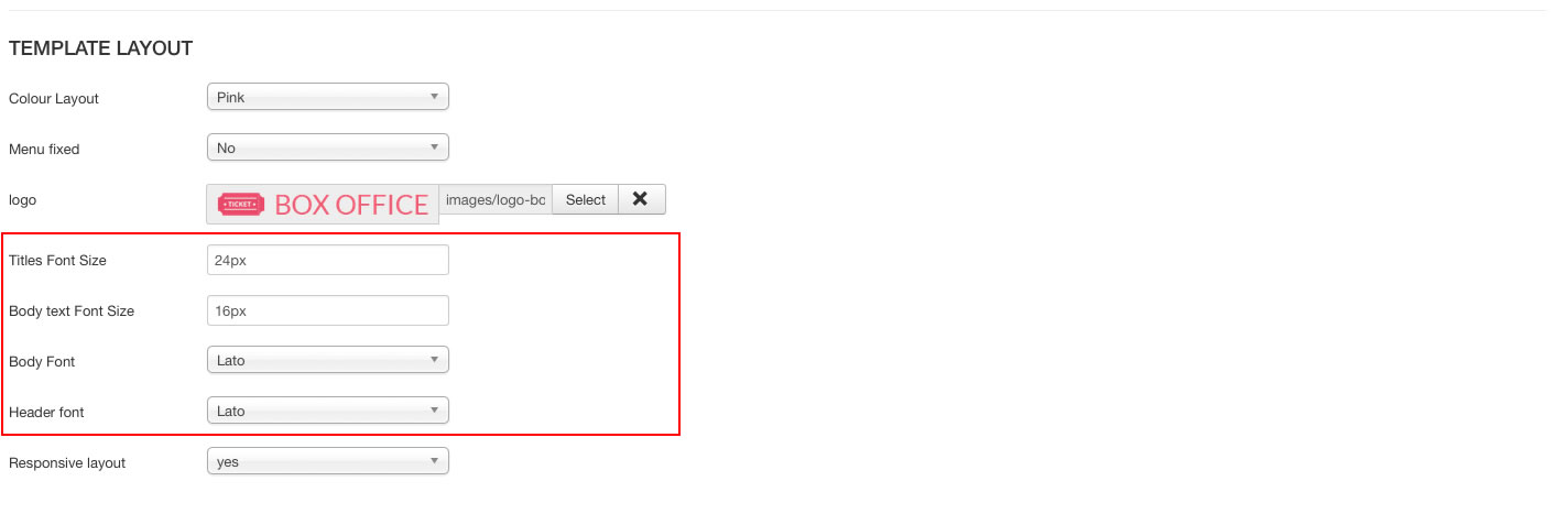
Template Fonts
You can choose different fonts and size for the website’s body and headers.
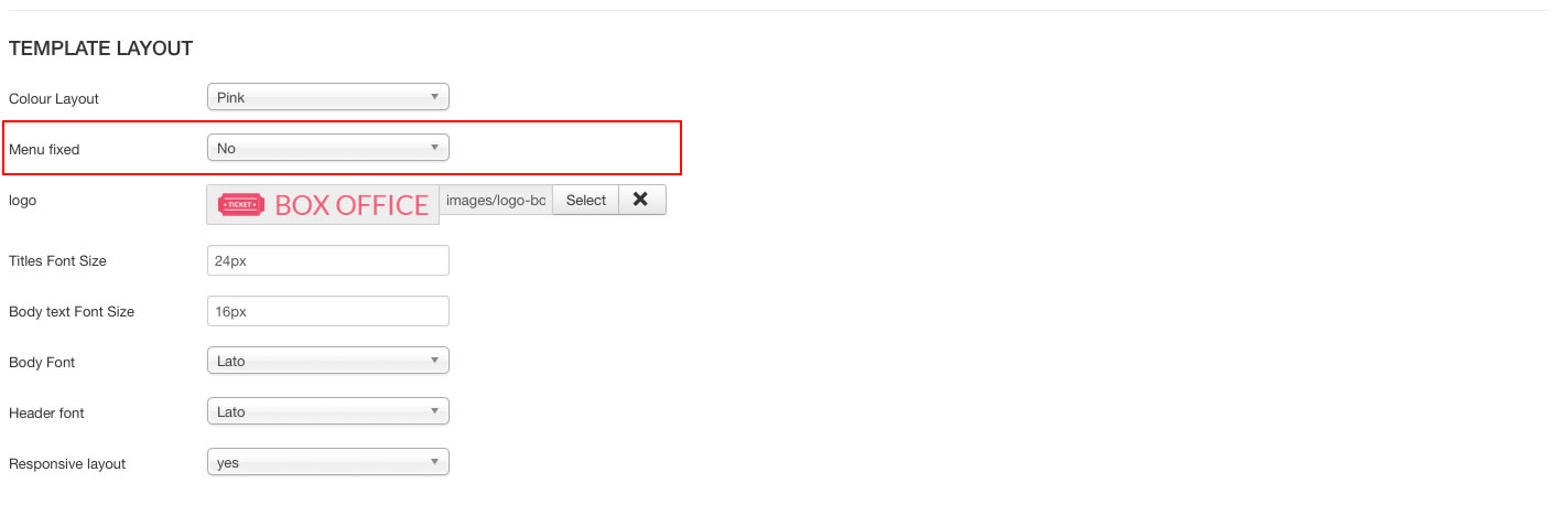
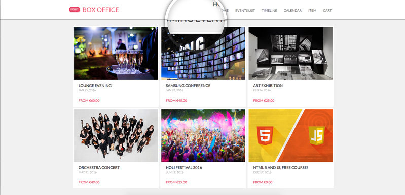
This parameter allow your header to stay up to the website when you are scrolling this one.
This is a preview:
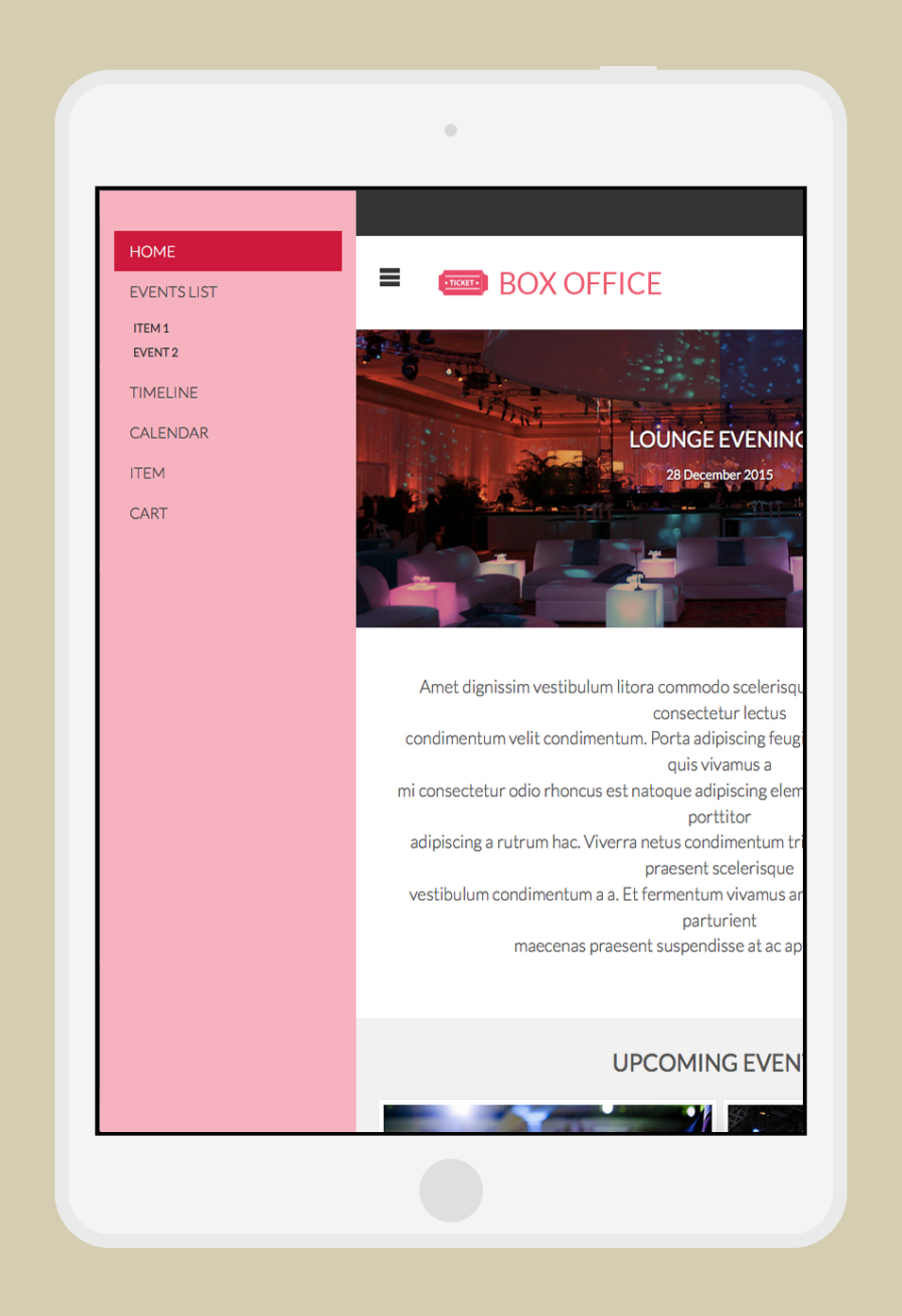
Responsive layout for all the devices
You can chose if make your website compatible with all the devices with this parameter.
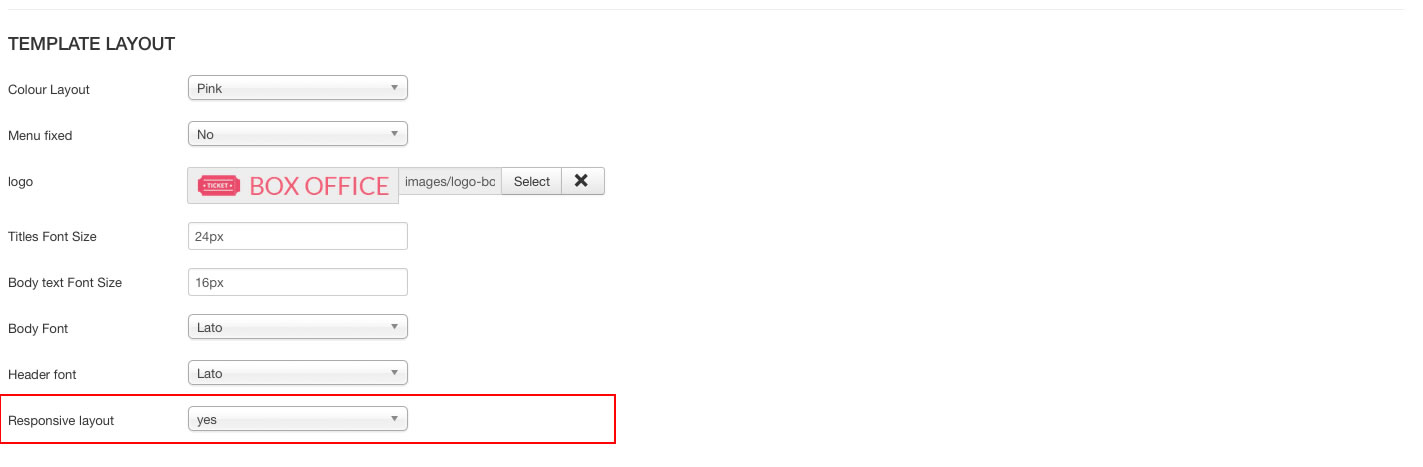
This is a preview:
Set up your Joomla Main Menu
Create the menu
After installation of the template click on Menus » Menu Manager Menu » Add New Menu in the administration menu on top. Give it a name and click on Save & Close.
You can now assign menu items to the menu. Click on Menus » YOUR MENU » Add New Menu Item.
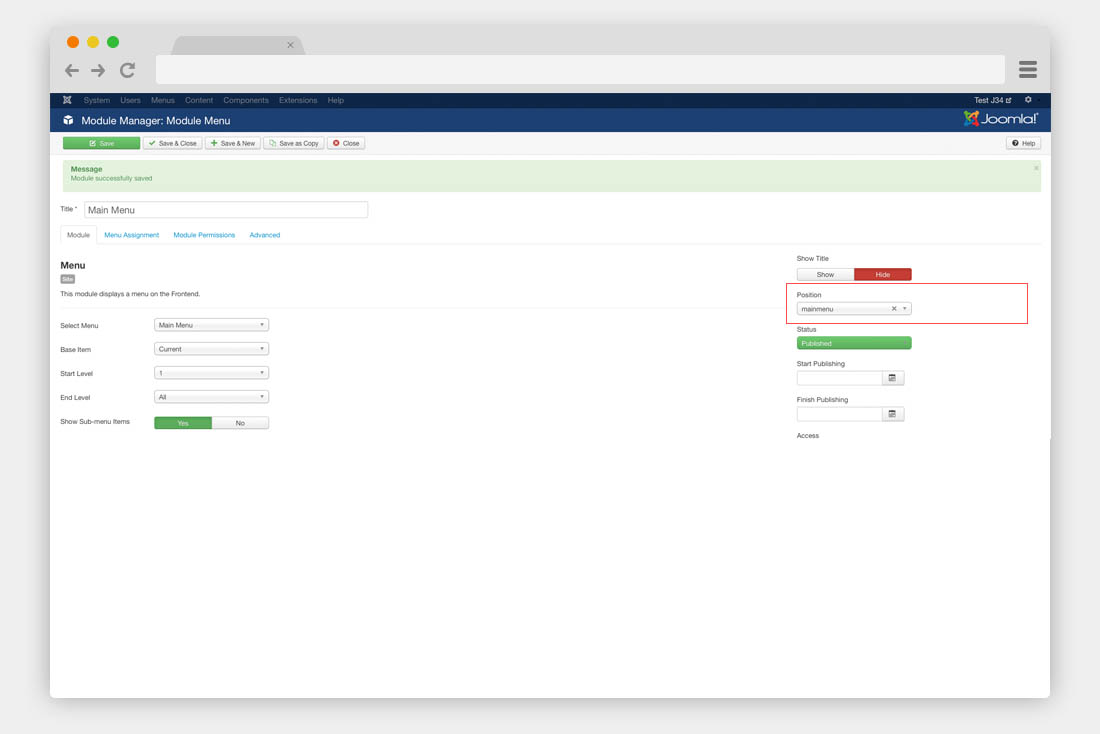
Assign the menu
Before the menu works properly in your template, you have to assign it to a menu module published on the mainmenu module position. To achieve this, click on Extensions » Module Manager » New. Choose Menu. Next publish the module on the mainmenu position of the template.
Modules configuration
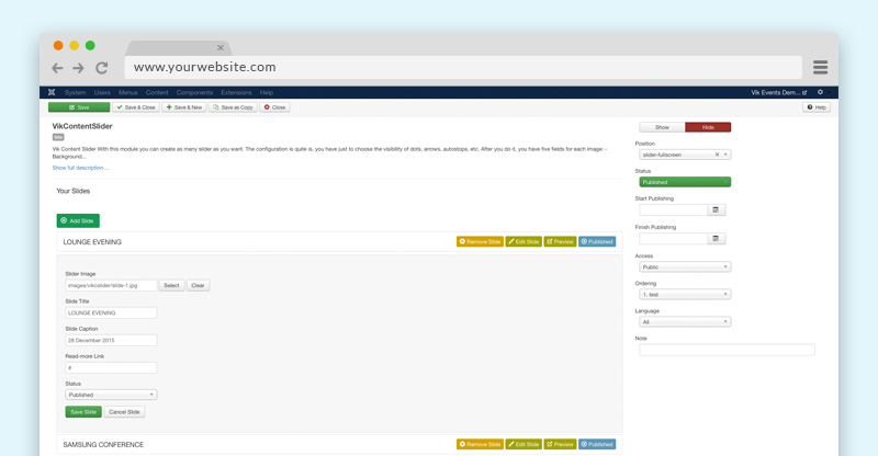
Setup the slider module
With this module you can create as many slider as you want through the "Add slide" button. The configuration is quite simple, you should just to choose the visibility of dots, arrows, autostop, etc.
Once you have done it, you have five fields for each image:
Module-position: slider-fullscreen
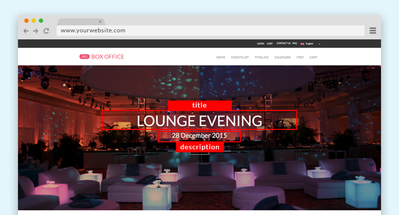
- Background image This field allow you to choose the images
- Title slide In this field you can write the title of your slide
- Text This is the field for the description of your slide
- Read More link In this field you may to insert a link for your slide
ADMIN SIDE:
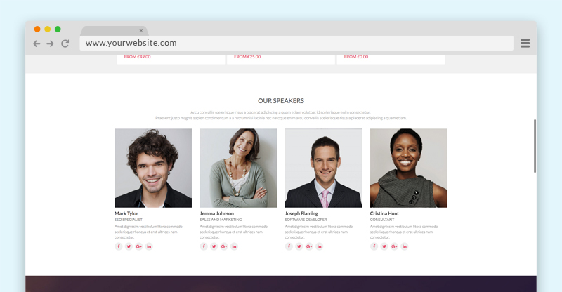
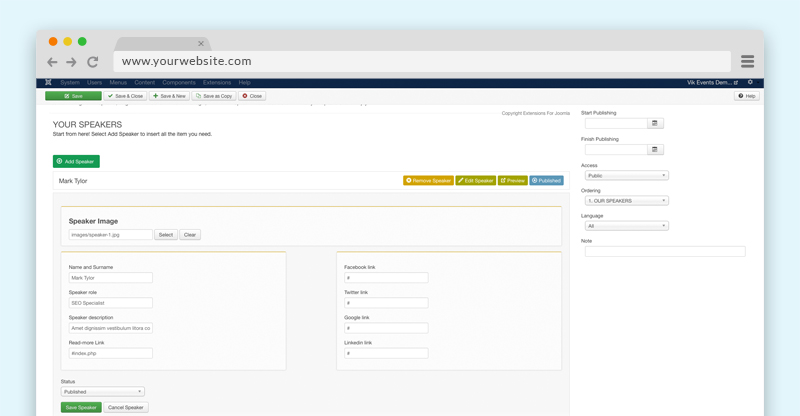
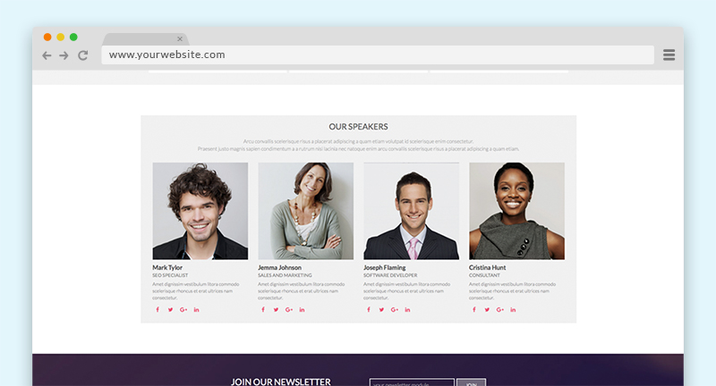
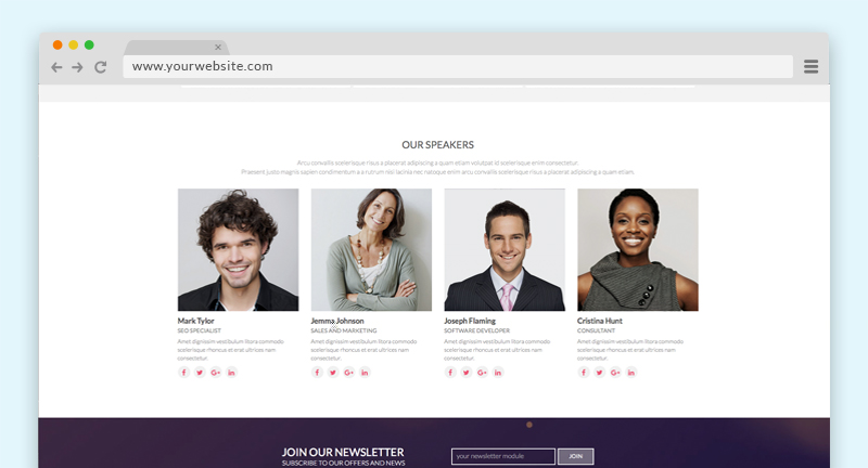
Vik Speakers
With this module you can create speakers or people profile.
The configuration is quite is, you have just to click on "Add speaker" and start to fill all your person profile, you can add all the profiles you want, you can also choose how many profile you want in a single raw.
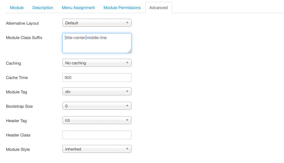
Module-position: fullbox
Class-suffix: module-centered title-center (please leave a white space before start to write - for more information how to do it, just look the next chapter)
Class-suffix: module-centered title-center (please leave a white space before start to write - for more information how to do it, just look the next chapter)
For each profile you can have the fields:
- Name and Surname
- Speaker role
- Speaker description
- Read more link (you can create a profile article and link it from this field)
- The most important social network profile link
ADMIN SIDE:
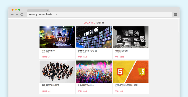
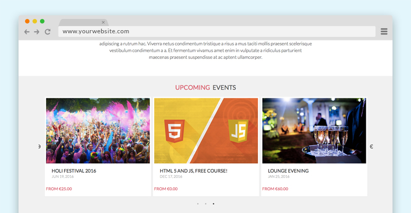
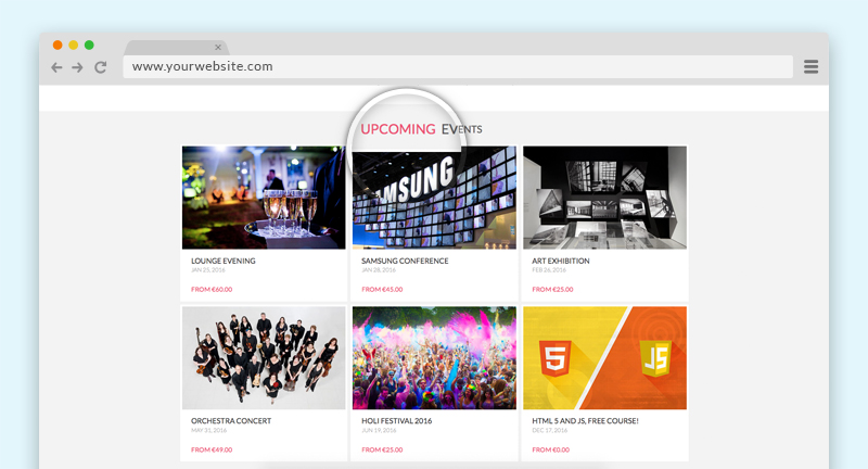
Vik Events Upcoming
Module-position: module-box2
Class-suffix: bg-transp title-center (please leave a white space before start to write - for more information how to do it, just look the next chapter)
You can find this module in the Vik Events component package.
This module shows the Upcoming events of our Vik Events Component.
- Item Displayed How many items you want to shows in your Front End
- Item Scolled How many items you want scroll when in the autoplay mode or with the navigations
- Speed Scrolling The speed of the scrolling
- Number of Events Total number of events showed, this value is necessary if you want to use the Grid view
- Autoscrolling Enable the autroscrolling
- Show arrows This params shows the navigation buttons
- Infinity Loop If set to no the scrolling will not start again automatically
- Max Chars for Descr To set the maximum characters allowed for the description
- Show image event You can show or hide the image event
- Show starting price This params can show or hide the price of the event
- Show Description You can show or hide the description event
- Description hover With this parameter you can show the description at the hover event
- Show Read more You can show or hide the read more text
- Choose Layout In this module you can have two different kind of layouts Scroller or Grid (below some example)
GRID VIEW:
SCROLLER:
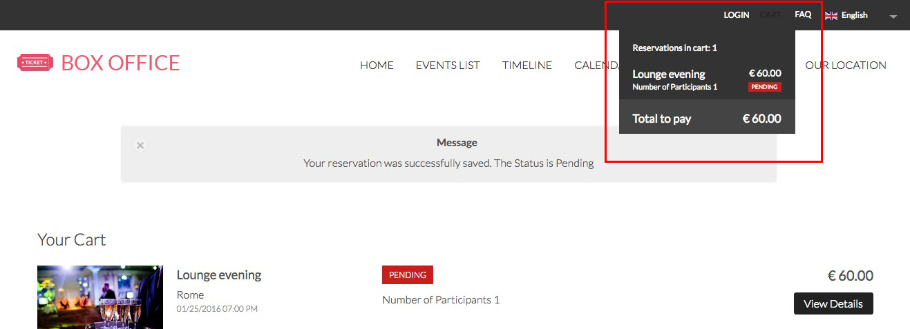
Vik Events Cart
Module-position: upmenu-right
Class-suffix: modopen cart (please leave a white space before start to write - for more information how to do it, just look the next chapter)
You can find this module in the Vik Events component package.
This module shows the summary of your shopping status, it works just pending status. To have multiple events in your cart you need to complete the payment with a Pending order for each event you want to buy.
Set your position with our Vik Google Maps
Module-position: fullbox
Module to locate your important points with Google Maps, the module allows you to customize every point with a marker, title and description.
Furthermore, in the new version of this module we added the possibility to insert your contact data and show them in three different position.
Set the latitude and the longitude coordinates of your locations and optionally add a text, a description and a customized image and shadow for the marker.
The default images are located in the folders /modules/mod_vikgooglemaps/src/markers/markers/ shadows and shapes.
Leave the image fields empty to use the default Google Marker.
MODULE PARAMETERS:
Map Setting:
- Map width and Map height in this fields you need to set the size of your map, if you want a full size map, use the 100% value for the width and then set a fixed height, an example 400px
- Map style the module allows you to choose different map style for your website
- Map Center and Zoom level this three parameters are very important to center your map and give it a properly view, you need to set up to see correctly your map
Contact Details:
with this view you insert all your contact details and choose where position, you can always disable it whenever you want through the params Contact enabled.
Locations:
in this view you can insert your locations and for each one choose the type of marker you want, title and description of your point and set it up the longitude and latitude.
Vik Wall Image
This module allow you to insert a big image as a background of a particular template area.
Module-position: fullbox
Class-suffix: custom-newsletter (please leave a white space before start to write - for more information how to do it, just look the next chapter)
Class-suffix: custom-newsletter (please leave a white space before start to write - for more information how to do it, just look the next chapter)
Module's fields:
- Background - with this parameter you can insert the background image that you want.
- Your content - here you can insert all the content that you want to be showed over the image.
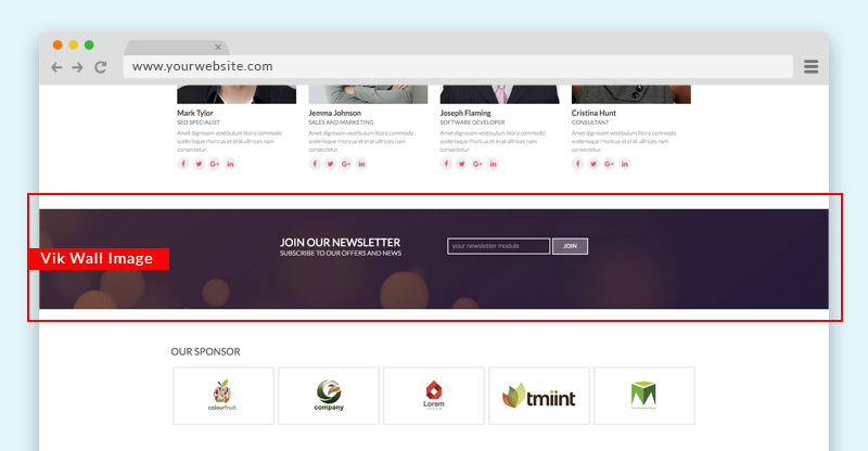
In our demo website the newsletter element is not a real module but just html code, we don't have any newsletter module.
MODULE PARAMETERS:
- Enable Mask - This command create a mask over your image, in this way, if you'll write some text you can read it more easily.
- Color Mask - With this colorpicker you can decide the color of your mask
- Level opacity mask - With this parameter you can decide how need to be transparent your mask
- Prepare content - it's the parameter that you need to enable if you want embed some modules using in the textarea of Vik Wall Image
Backend example 1 - Backend example 2
Here the code of our demo website that you can easily copy in your textarea:
<div class="e4j-newslett">
<div class="e4j-float-left">
<h3>JOIN OUR NEWSLETTER</h3>
<h4>SUBSCRIBE TO OUR OFFERS AND NEWS</h4>
</div>
<div class="e4j-float-right">
<div><input type="text" /><input type="submit" value="JOIN" /></div>
</div>
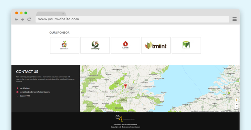
</div>Our sponsor module
Module-position: fullbox
Class-suffix: module-centered (please leave a white space before start to write - for more information how to do it, just look the next chapter)
Class-suffix: module-centered (please leave a white space before start to write - for more information how to do it, just look the next chapter)
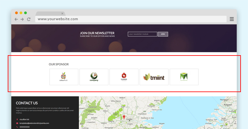
This is a a custom html module and we created a basic structure, if you want use the same one, you can easily copy and past the following code and override with your information:
<div class="sponsor-main">
<div><img src="images/partners/1.jpg" border="0" alt="" /></div>
<div><img src="images/partners/2.jpg" border="0" alt="" /></div>
<div><img src="images/partners/3.jpg" border="0" alt="" /></div>
<div><img src="images/partners/4.jpg" border="0" alt="" /></div>
<div><img src="images/partners/5.jpg" border="0" alt="" /></div>
</div>
Module variations
To customize your website you can use the class suffix for different modules, all the class suffix need to be written with a white space just before, in this way:
you can also use more than one class suffix, in the case that you want mix two kind of layout, an example a centered title with borders (you can read about those class just below), in the case that you want mix both the class you always need to leave a white space between them, in this way:
Here the list of the class suffix that you can use with this template, beside you can see their example:
1. Grey Background
With this class suffix you can have a grey background instead of the default white one.
Class-suffix: grey
2. Title Center
With this class suffix you can have the title of your module centered.
Class-suffix: title-center
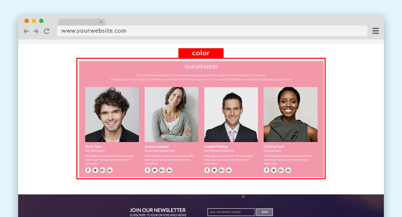
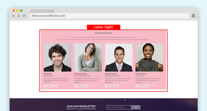
3. Color module background
With these two class suffix you can have two different colors background, this color depends by the Template layout that you chose.
Class-suffix: color
Class-suffix: color-light
Class-suffix: color-light
4. Footer inline
With this class suffix you'll have yours item menu footer in the same line instead in the classical list view.
Class-suffix: inline
Menu subtitle
To add an item menu subtitle you need to follow this steps:
1. Open the item menu where you want to add your subtitle. Example
2. add two pipes between the first part of your Menu title and the part that you want to be your subtitle. Example
3. Save you item menu
Here it's the Front-end example:
Title module double color
To have the title module with two colors, like our demo website, you should use a procedure really similar to the subtitle menu, you have to use two pipes between the two title parts Backend example.
Here the Frontend example:
Hide module on smartphone
With this class suffix you are going to hide a particular module in the smarthphone view.
Class-suffix: device-off
Other modules
Login module
As you can see in our demo website, we used a particular login display, to have this kind of layout, please, follow this instructions:
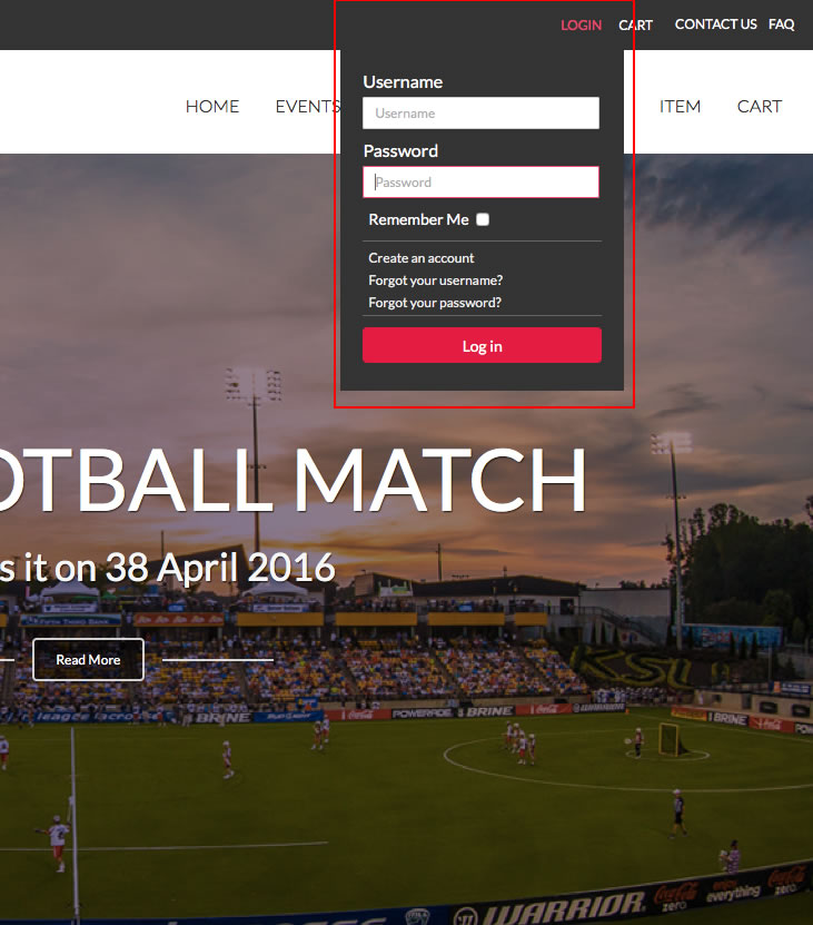
We used the Basic login module of Joomla.
Go to Extensions » Modules Manager. Click on New. Select a Login module
Module-position: upmenu-right
Class-suffix: loginmenu (please leave a white space before start to write - for more information how to do it, just look the next chapter)
Class-suffix: loginmenu (please leave a white space before start to write - for more information how to do it, just look the next chapter)
Languages switcher module
To have a multilanguage website you can use the native language manager of Joomla, in our demo website we used the Languages switcher module.
Go to Extensions » Modules Manager. Click on New. Select a Languages switcher
With this module you can choose if you want a dropdown list of your languages or just the little flags listed, we used the dropdown display:
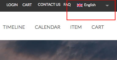
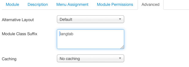
Module-position: upmenu-right
Class-suffix: langtab (please leave a white space before start to write - for more information how to do it, just look the next chapter)
Class-suffix: langtab (please leave a white space before start to write - for more information how to do it, just look the next chapter)
To see how we setup this module in the Back-end: Page 1 Page 2
CSS Customization
You can add your css customization inside the file custom.css, that you can modify through the panels:
Extensions > Templates > Templates > E4J BoxOffice Details and Files > css > custom.css
PLEASE NOTE: because our templates don’t have any automatic update system, EVERY template update will override ALL YOUR MODIFICATIONS inside the custom.css, so you should ALWAY BACKUP and reload it in the new release.
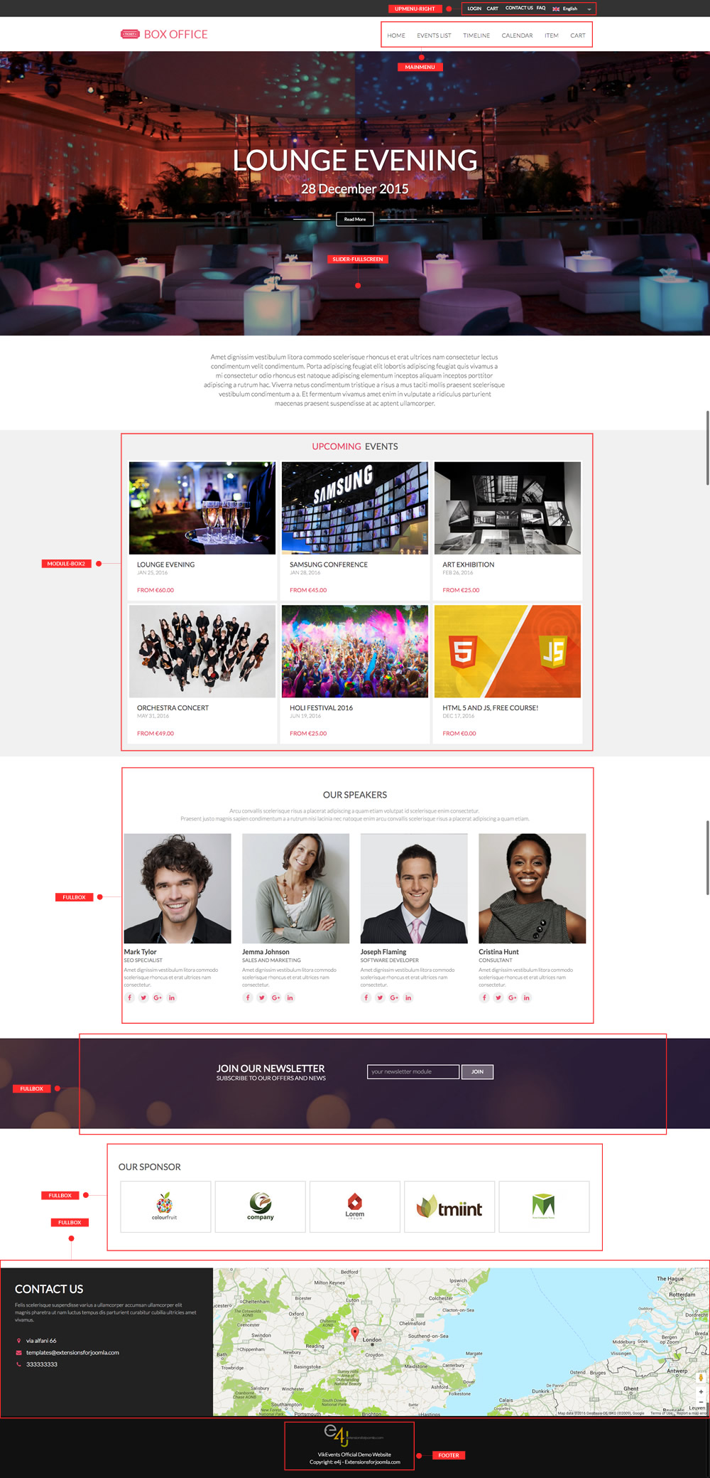
Modules Map positions
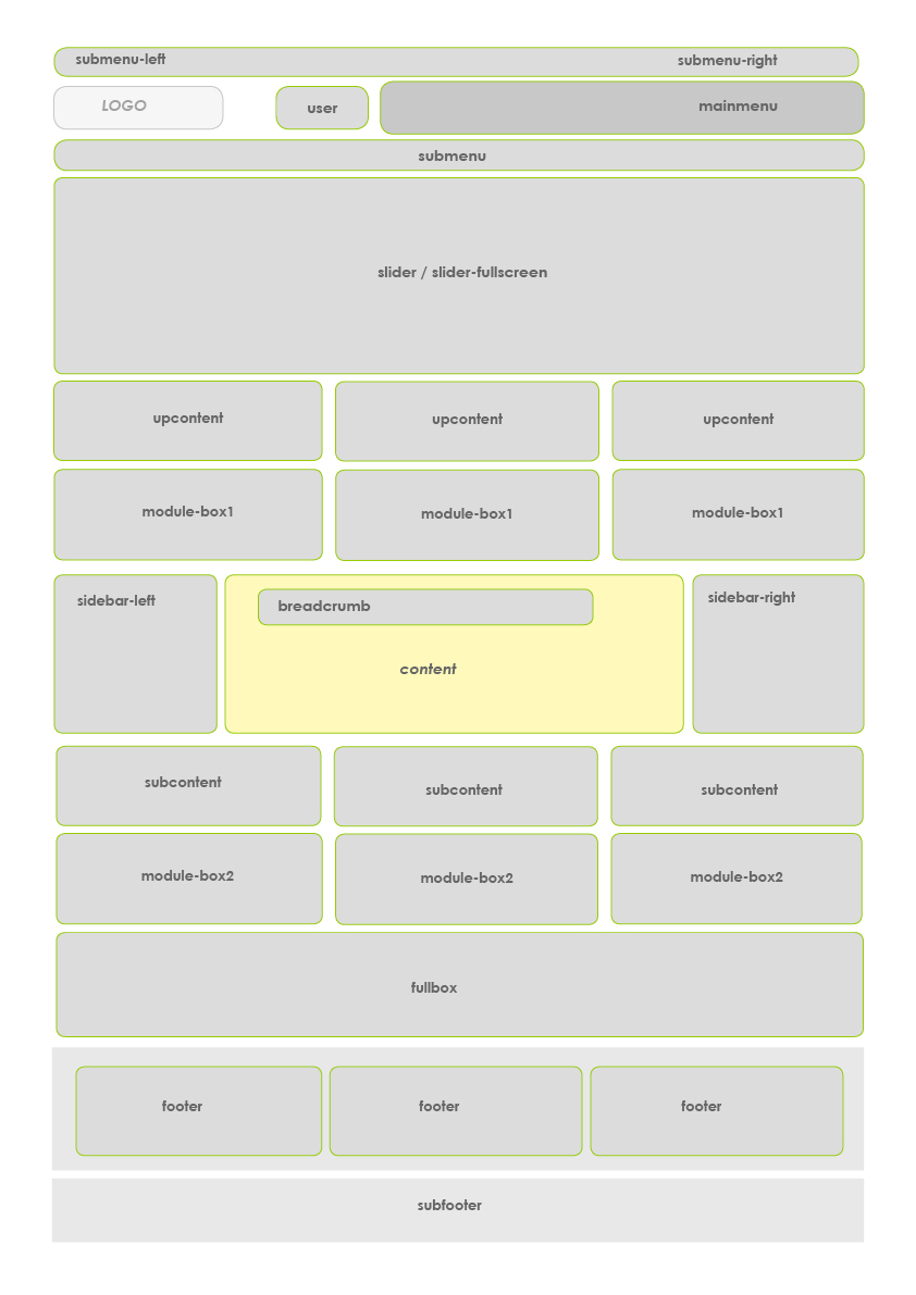
Positions of our demo website
General troubleshooting
jQuery Conflicts
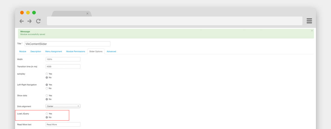
Sometimes happens, when you'd installed all the modules, that the Vik Content Slider is not working or that shows your images one just after the other in one vertical line.
In this case your website has a jQuery Conflicts, it means that too many extensions are loading the jQuery library, to solve this problem you have to disable all the Load jQuery parameters in all the Vik Extensions that are enabled and from the Slider modules either.
THEME UPDATE
From the version 1.6, has been added the automatic update.
To know how to update the template, please, check our Knowledge Base on this link.